Bootstrap progress bar
This chapter will explain Bootstrap progress bar. In this tutorial, you'll see how to create progress bar loading Bootstrap, redirect, or operating state.
 Bootstrap progress bar using CSS3 transitions and animations to get the effect. Older versions of Internet Explorer and Firefox 9 and earlier does not support this feature, Opera 12 does not support animations.
The default progress bar
Create a basic progress bar, follow these steps:
- Add aclass .progress with the <div>.
- Then, in the above <div> inside, add aclass .progress-bar with an empty <div>.
- Add a style attribute with a width expressed as a percentage, such as style = "60%"; 60% represents the location of the progress bar.
Let's look at the following examples:
Examples
<Div class = "progress">
<Div class = "progress-bar" role = "progressbar" aria-valuenow = "60"
aria-valuemin = "0" aria-valuemax = "100" style = "width: 40%; ">
<Span class = "sr-only"> 40% completed </ span>
</ Div>
</ Div>
The results are as follows:
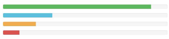
Alternate progress bar
To create a different style progress bar as follows:
- Add aclass .progress with the <div>.
- Then, in the above <div> inside, add aclass .progress-bar and progress-bar- *empty class with a <div>. Where * can besuccess, info, warning, danger.
- Add a style attribute with a width expressed as a percentage, such as style = "60%"; 60% represents the location of the progress bar.
Let's look at the following examples:
Examples
<Div class = "progress">
<Div class = "progress-bar progress- bar-success" role = "progressbar"
aria-valuenow = "60" aria-valuemin = "0" aria-valuemax = "100"
style = "width: 90%; ">
<Span class = "sr-only"> 90% complete (successfully) </ span>
</ Div>
</ Div>
<Div class = "progress">
<Div class = "progress-bar progress- bar-info" role = "progressbar"
aria-valuenow = "60" aria-valuemin = "0" aria-valuemax = "100"
style = "width: 30%; ">
<Span class = "sr-only"> 30% complete (Information) </ span>
</ Div>
</ Div>
<Div class = "progress">
<Div class = "progress-bar progress- bar-warning" role = "progressbar"
aria-valuenow = "60" aria-valuemin = "0" aria-valuemax = "100"
style = "width: 20%; ">
<Span class = "sr-only"> 20% complete (warning) </ span>
</ Div>
</ Div>
<Div class = "progress">
<Div class = "progress-bar progress- bar-danger" role = "progressbar"
aria-valuenow = "60" aria-valuemin = "0" aria-valuemax = "100"
style = "width: 10%; ">
<Span class = "sr-only"> 10% complete (danger) </ span>
</ Div>
</ Div>
The results are as follows:
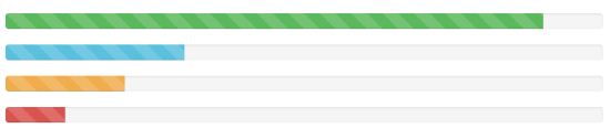
Progress bar stripes
Create a progress bar stripe, follow these steps:
- Adding with aclass .progress and .progress-stripedthe <div>.
- Then, in the above <div> inside, add aclass .progress-bar and progress-bar- *empty class with a <div>. Where * can besuccess, info, warning, danger.
- Add a style attribute with a width expressed as a percentage, such as style = "60%"; 60% represents the location of the progress bar.
Let's look at the following examples:
Examples
<Div class = "progress progress-striped" >
<Div class = "progress-bar progress- bar-success" role = "progressbar"
aria-valuenow = "60" aria-valuemin = "0" aria-valuemax = "100"
style = "width: 90%; ">
<Span class = "sr-only"> 90% complete (successfully) </ span>
</ Div>
</ Div>
<Div class = "progress progress-striped" >
<Div class = "progress-bar progress- bar-info" role = "progressbar"
aria-valuenow = "60" aria-valuemin = "0" aria-valuemax = "100"
style = "width: 30%; ">
<Span class = "sr-only"> 30% complete (Information) </ span>
</ Div>
</ Div>
<Div class = "progress progress-striped" >
<Div class = "progress-bar progress- bar-warning" role = "progressbar"
aria-valuenow = "60" aria-valuemin = "0" aria-valuemax = "100"
style = "width: 20%; ">
<Span class = "sr-only"> 20% complete (warning) </ span>
</ Div>
</ Div>
<Div class = "progress progress-striped" >
<Div class = "progress-bar progress- bar-danger" role = "progressbar"
aria-valuenow = "60" aria-valuemin = "0" aria-valuemax = "100"
style = "width: 10%; ">
<Span class = "sr-only"> 10% complete (danger) </ span>
</ Div>
</ Div>
The results are as follows:
Animated progress bar
Create an animated progress bar, follow these steps:
- Adding with aclass .progress and .progress-stripedthe <div>. While addingclass .active.
- Then, in the above <div> inside, add aclass .progress-bar with an empty <div>.
- Add a style attribute with a width expressed as a percentage, such as style = "60%"; 60% represents the location of the progress bar.
This will make the stripes have a sense of movement from right to left.
Let's look at the following examples:
Examples
<Div class = "progress progress-striped active ">
<Div class = "progress-bar progress- bar-success" role = "progressbar"
aria-valuenow = "60" aria-valuemin = "0" aria-valuemax = "100"
style = "width: 40%; ">
<Span class = "sr-only"> 40% completed </ span>
</ Div>
</ Div>
The results are as follows:
Stacked progress bar
You can even stack multiple progress bar. Multiple progress bars on the same.progress stack can be realized, as shown in the following examples:
Examples
<Div class = "progress">
<Div class = "progress-bar progress- bar-success" role = "progressbar"
aria-valuenow = "60" aria-valuemin = "0" aria-valuemax = "100"
style = "width: 40%; ">
<Span class = "sr-only"> 40% completed </ span>
</ Div>
<Div class = "progress-bar progress- bar-info" role = "progressbar"
aria-valuenow = "60" aria-valuemin = "0" aria-valuemax = "100"
style = "width: 30%; ">
<Span class = "sr-only"> 30% complete (Information) </ span>
</ Div>
<Div class = "progress-bar progress- bar-warning" role = "progressbar"
aria-valuenow = "60" aria-valuemin = "0" aria-valuemax = "100"
style = "width: 20%; ">
<Span class = "sr-only"> 20% complete (warning) </ span>
</ Div>
</ Div>
The results are as follows: