Bootstrap Form
Bootstrap provides a clear layout created table. The following table lists some table elements Bootstrap support:
| label | description |
|---|---|
| <Table> | Adding to form the basis of style. |
| <Thead> | Table container element header row (<tr>), used to identify the table columns. |
| <Tbody> | Table container element in the body of the table row (<tr>). |
| <Tr> | A group appear on a single line in the container element of the table cell (<td> or <th>). |
| <Td> | The default table cell. |
| <Th> | Special table cell, used to identify the column or row (depending on the extent and location). You must use the <thead> inside. |
| <Caption> | About table store content description or summary. |
Form class
The following table style tables can be used:
| class | description | Examples |
|---|---|---|
| .table | Arbitrary <table> Add base style (only horizontal separator) | try it |
| .table-striped | In the <tbody> within the form to add zebra stripes (IE8 does not support) | try it |
| .table-bordered | Add a border for all table cells | try it |
| .table-hover | In the <tbody> within any row enable hover state | try it |
| .table-condensed | Make more compact form | try it |
| Joint use of all forms classes | try it | |
<Tr>, <th> and <td> class
Classes The following table can be used to form a row or cell:
| class | description | Examples |
|---|---|---|
| .active | The hover color application on line or cell | try it |
| .success | It indicates a successful operation | try it |
| .info | Information representing varying operating | try it |
| .warning | It represents a warning operation | try it |
| .danger | It represents a dangerous operation | try it |
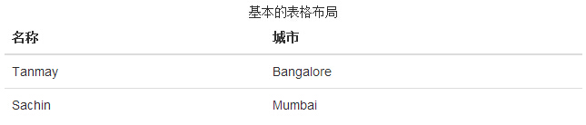
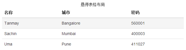
The basic form
If you want only with a padding (padding) and basic table level split, addclass.table, as shown in the following examples:
Examples
try it"
The results are as follows:
Optional Form class
In addition to the basic table markup and .table class, and some can be used as a marker to define the style classes. The following will introduce you to these classes.
Striped table
By adding.table-striped class,you will see the streaks on the line <tbody> within, as the following example shows:
Examples
try it"
The results are as follows:
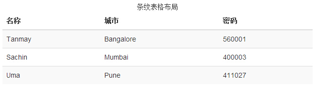
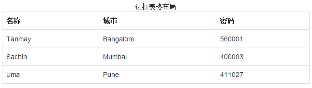
Table Border
By adding.table-bordered class,you will see that each element has a border around, and the total is rounded form, as shown in the following example:
Examples
try it"
The results are as follows:
Hover table
By adding.table-hover class,when the pointer is over the row when there will be a light gray background, as shown in the following examples:
Examples
try it"
The results are as follows:
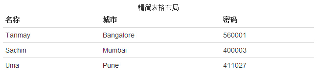
Compact Form
By adding.table-condensed class,inline padding (padding) are cut in half, so that the table looks more compact, as shown in the following example. This information is useful when you want to look more compact.
Examples
try it"
The results are as follows:
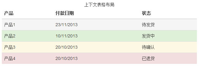
Context class
Context class listed in the following table allows you to change the background color of table rows or individual cells.
| 类 | 描述 |
|---|---|
| .active | 对某一特定的行或单元格应用悬停颜色 |
| .success | 表示一个成功的或积极的动作 |
| .warning | 表示一个需要注意的警告 |
| .danger | 表示一个危险的或潜在的负面动作 |
These classes can be applied to the <tr>, <td> or <th>.
Examples
try it"
The results are as follows:
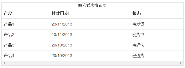
Responsive table
By any.tablewrapped in.table-responsive class,you can have the table to scroll horizontally to accommodate small devices (less than 768px). When viewed on a large-scale equipment is larger than 768px wide, you will not see any difference.
Examples
try it"
The results are as follows: