Bootstrap grid system
This section will explain the Bootstrap grid system (Grid System).
Bootstrap provides a responsive, mobile-preferred flow grid system, with the increase in screen or viewport (viewport) size, the system will automatically be divided into a maximum of 12.
What is a grid (Grid)?
From Wikipedia:
In graphic design, the grid is a series of straight lines used to organize content by the intersecting (vertical, horizontal) structure consisting of (usually two-dimensional). It is widely used in the design print design layout and content structure. In web design, it is a used to quickly create a consistent and effective layout using HTML and CSS approach.
Simply put, web design grid for organizing the content so that the site is easy to navigate, and to reduce the client load.
What is the Bootstrap grid system (Grid System)?
Bootstrap official documentation on grid system Description:
Let us understand how the above statement. Bootstrap 3 is a mobile device priority, in this sense, Bootstrap code for small screen devices (such as mobile, tablet), then extended to large screen devices (such as laptops, desktop computers) on the components and the grid.
Mobile-first strategy
- content
- Decide what is most important.
- layout
- Priority designed smaller width.
- CSS-based mobile devices is a priority, media queries are directed to tablet computers, desktop computers.
- Progressive Enhancement
- With the increase of screen size and add elements.
Responsive grid system with increasing screen or viewport (viewport) size, the system will automatically be divided into a maximum of 12.
| 1 | 1 | 1 | 1 | 1 | 1 | 1 | 1 | 1 | 1 | 1 | 1 |
| 4 | 4 | 4 | |||||||||
| 4 | 8 | ||||||||||
| 6 | 6 | ||||||||||
| 12 | |||||||||||
Bootstrap grid system (Grid System) works
The grid system through a series of rows and columns with content to create a page layout. The following lists the Bootstrap grid system is how it works:
- Row must be placed in.container class, in order to obtain proper alignment (alignment) and padding (padding).
- Use lines to create a horizontal set of columns.
- Content should be placed in the column, and the column can be only direct child rows.
- Predefined grid classes, such.row and .col-xs-4,can be used to quickly create a grid layout. LESS mixed class can be used more semantic layouts.
- Column to create a gap between the contents of the column by padding (padding). The padding is from outside.rows through on the (margin) negation, and the last row, first column indicates an offset.
- The grid system is available by specifying the twelve columns that you want to create a cross. For example, to create three equal columns, use three.col-xs-4.
Media queries
Media queries are very chic "conditional CSS rules." It only applies to some based on some predetermined criteria CSS. If those conditions are satisfied, then apply the appropriate style.
Bootstrap media queries allow you to move based on the size of the viewport, show and hide content. The following media queries using LESS files used to create Bootstrap grid system critical demarcation point threshold.
/ * Ultra-small devices (mobile phones, less than 768px) * /
/ * By default, the Bootstrap no media queries * /

/ * Small devices (tablet, 768px onwards) * /
@media (min-width: @ screen-sm-min) {...}

/ * Medium devices (desktop, 992px onwards) * /
@media (min-width: @ screen-md-min) {...}

/ * Large equipment (large desktop computer, 1200px onwards) * /
@media (min-width: @ screen-lg-min) {...}
We sometimes containmax-width media query in the code, which will affect the CSS confined within a smaller range of screen sizes.
@media (max-width: @ screen-xs-max) {...}
@media (min-width: @ screen-sm-min) and (max-width: @ screen-sm-max) {...}
@media (min-width: @ screen-md-min) and (max-width: @ screen-md-max) {...}
@media (min-width: @ screen-lg-min) {...}
Media query has two parts, first a device specification, then a size rule. In the above case, set the following rules:
Let's look at this line of code:
@media (min-width: @ screen-sm-min) and (max-width: @ screen-sm-max) {...}
For all with amin-width: @ screen-sm-mindevices, if the width of the screen is less than@ screen-sm-max,it will do some processing.
Grid Options
The following table summarizes how the Bootstrap grid system across multiple devices work:
| 超小设备手机(<768px) | 小型设备平板电脑(≥768px) | 中型设备台式电脑(≥992px) | 大型设备台式电脑(≥1200px) | |
|---|---|---|---|---|
| 网格行为 | 一直是水平的 | 以折叠开始,断点以上是水平的 | 以折叠开始,断点以上是水平的 | 以折叠开始,断点以上是水平的 |
| 最大容器宽度 | None (auto) | 750px | 970px | 1170px |
| Class 前缀 | .col-xs- | .col-sm- | .col-md- | .col-lg- |
| 列?数量和 | 12 | 12 | 12 | 12 |
| 最大列宽 | Auto | 60px | 78px | 95px |
| 间隙宽度 | 30px (一个列的每边分别 15px) | 30px (一个列的每边分别 15px) | 30px (一个列的每边分别 15px) | 30px (一个列的每边分别 15px) |
| 可嵌套 | Yes | Yes | Yes | Yes |
| 偏移量 | Yes | Yes | Yes | Yes |
| 列排序 | Yes | Yes | Yes | Yes |
The basic structure of the grid
Here is the basic structure of the Bootstrap grid:
<Div class = "container">
   <Div class = "row">
      <Div class = "col - * - *"> </ div>
      <Div class = "col - * - *"> </ div>
   </ Div>
   <Div class = "row"> ... </ div>
</ Div>
<Div class = "container"> ....
Let a few simple examples we look at the grid:
- Example: stack level
- Example: medium and large equipment
- Examples: mobile phones, tablet computers, desktop computers
Responsive columns reset
The following example includes four grid, but we can not determine the position of the grid is displayed in a small device browsing.
To solve this problem, you can use use.clearfix class and responsive utility to resolve, as shown in the following examples:
Examples
try it"
Browser resize the window to see the changes, or to view the effect on your phone.
Offset column
The offset is a useful function for more professional layout. They can be used to make more space for the column. Forexample, .col-xs = * class does not support offsets, but they can be simply by using an empty cell to achieve the effect.
In order to use the offset on a large screen display, use.col-md-offset- * category.Left outside these classes would a column from the (margin) increased* column, where *range is from1-11.
In the following example, we have <div class = "col-md -6"> .. </ div>, we will use.col-md-offset-3 class to center this div.
Examples
try it"
The results are as follows:

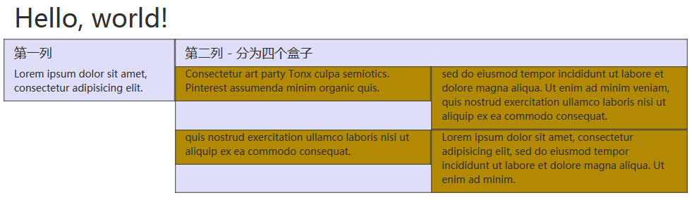
Nested Column
The default for nested grids in the content, add a new.row, and within an existing column .col-md- *Add a group.col-md- *columns. Nested row should contain a set of columns, which set the number of columns can not be more than 12 (in fact, there is no requirement that you have to fill 12).
In the following example, the layout has two columns, the second column is divided into two rows of four boxes.
Examples
try it"
The results are as follows:
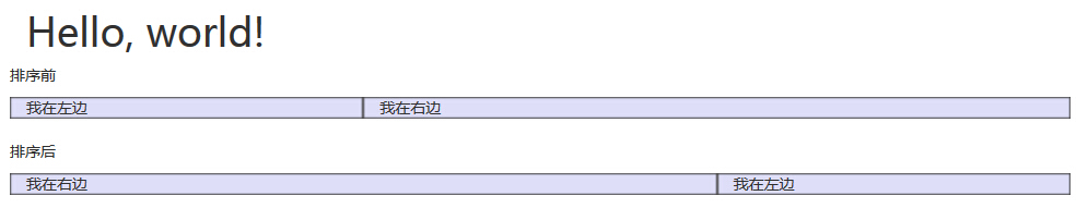
Column sorting
Bootstrap grid system to another perfect feature is that you can easily write a column in an order, then the order is displayed in another column.
You can easily change the order with.col-md-push- built grid columns *and.col-md-pull- *class, where*range is from1-11.
In the following example, we have a two-column layout, left column is very narrow, as a sidebar. We will use.col-md-push- * and .col-md-pull- *class to swap the order of two columns.
Examples
try it"
The results are as follows: