Bootstrap Form
In this chapter, we will learn how to create a form using Bootstrap. Bootstrap some simple HTML tags and extended classes to create different styles of forms.
Bootstrap provides the following types of forms layout:
- Vertical Form (default)
- Inline Form
- Level form
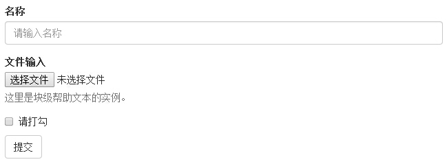
Vertical or basic form
The basic structure of the form is Bootstrap comes with individual form controls automatically receive some global style. Here are the steps to create a basic form:
- To the parent <form> element to addrole = "form".
- The labels and controls in aclass.form-group with the <div> in. This is necessary to obtain the best pitch.
- All text elements <input>, <textarea>, and <select> Addclass.form-control.
Examples
<Form role = "form">
<Div class = "form-group">
<Label for = "name"> Name </ label>
<Input type = "text" class = "form-control" id = "name" placeholder = "Please enter the name">
</ Div>
<Div class = "form-group">
<Label for = "inputfile"> File Input </ label>
<Input type = "file" id = "inputfile">
<P class = "help-block"> Here is a block-level help text instance. </ P>
</ Div>
<Div class = "checkbox">
<Label>
<Input type = "checkbox"> Please tick </ label>
</ Div>
<Button type = "submit" class = "btn btn-default" > Submit </ button>
</ Form>
The results are as follows:
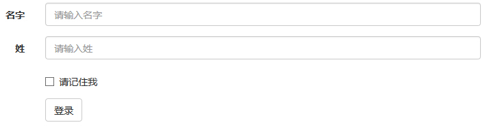
Inline Form
If you need to create a form that all elements are inline, left aligned labels are side by side, add theclass.form-inline to the <form> tag.
Examples
<Form class = "form-inline" role = "form">
<Div class = "form-group">
<Label class = "sr-only" for = "name"> Name </ label>
<Input type = "text" class = "form-control" id = "name" placeholder = "Please enter the name">
</ Div>
<Div class = "form-group">
<Label class = "sr-only" for = "inputfile"> File Input </ label>
<Input type = "file" id = "inputfile">
</ Div>
<Div class = "checkbox">
<Label>
<Input type = "checkbox"> Please tick </ label>
</ Div>
<Button type = "submit" class = "btn btn-default" > Submit </ button>
</ Form>
The results are as follows:
- By default, Bootstrap the input, select, and textarea 100% of the width. When using inline forms, you need to set a width in the form controls.
- Useclass.sr-only, you can hide the inline form tag.
Level form
The number of different levels and forms not only marks another form, but the form is presented in the form is different. To create a horizontal layout of the form, follow a few steps:
- <Form> element is added to the parentclass.form-horizontal.
- The labels and controls in aclass.form-group with the <div> in.
- Addclass.control-label to label.
Examples
<Form class = "form-horizontal" role = "form">
<Div class = "form-group">
<Label for = "firstname" class = "col-sm-2 control-label"> name </ label>
<Div class = "col-sm-10 ">
<Input type = "text" class = "form-control" id = "firstname" placeholder = "Please enter the name">
</ Div>
</ Div>
<Div class = "form-group">
<Label for = "lastname" class = "col-sm-2 control-label"> name </ label>
<Div class = "col-sm-10 ">
<Input type = "text" class = "form-control" id = "lastname" placeholder = "Please enter the name">
</ Div>
</ Div>
<Div class = "form-group">
<Div class = "col-sm-offset -2 col-sm-10">
<Div class = "checkbox">
<Label>
<Input type = "checkbox"> Remember my </ label>
</ Div>
</ Div>
</ Div>
<Div class = "form-group">
<Div class = "col-sm-offset -2 col-sm-10">
<Button type = "submit" class = "btn btn-default" > Log </ button>
</ Div>
</ Div>
</ Form>
The results are as follows:
Bootstrap support for the most common form controls, mainlyinput, textarea, checkbox, radio and select.
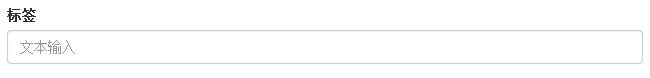
Input box (Input)
The most common form text field is an input box input. Users can enter most of the necessary form data therein. Bootstrap provides input support for all types of native HTML5,including: text, password, datetime, datetime-local, date, month, time, week, number, email, url, search, tel andcolor.Appropriatetypedeclaration is required, so as to allowinputfor complete style.
Examples
<Form role = "form">
<Div class = "form-group">
<Label for = "name"> tag </ label>
<Input type = "text" class = "form-control" placeholder = "text input">
</ Div>
</ Form>
The results are as follows:
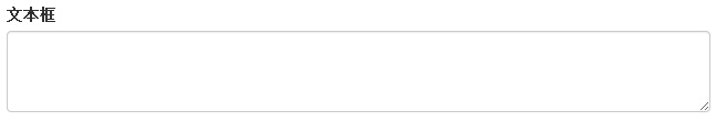
Box (Textarea)
When you need to make a multi-line input, you can use the text box textarea. You can change therowsproperty, if necessary (fewer rows = smaller box, line = more large box).
Examples
<Form role = "form">
<Div class = "form-group">
<Label for = "name"> Text Box </ label>
<Textarea class = "form-control" rows = "3"> </ textarea>
</ Div>
</ Form>
The results are as follows:
Checkbox (Checkbox) and radio button (Radio)
Check boxes and radio buttons are used to allow users to select from a range of preset options.
- When you create a form, if you want the user to choose several options from the list, please use thecheckbox.If you restrict the user can select an option, use theradio.
- A series of check boxes and radio buttons use.checkbox-inlineor.radio-inline class,control their display on the same line.
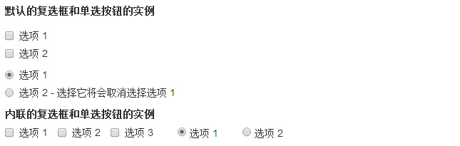
The following example demonstrates both types (default and inline):
Examples
<Label for = "name"> instance of the default check boxes and radio buttons </ label>
<Div class = "checkbox">
<Label>
<Input type = "checkbox" value = ""> Option 1 </ label>
</ Div>
<Div class = "checkbox">
<Label>
<Input type = "checkbox" value = ""> option 2 </ label>
</ Div>
<Div class = "radio">
<Label>
<Input type = "radio" name = "optionsRadios" id = "optionsRadios1" value = "option1" checked> Option 1 </ label>
</ Div>
<Div class = "radio">
<Label>
<Input type = "radio" name = "optionsRadios" id = "optionsRadios2" value = "option2"> Option 2 - Selecting it will deselect the option 1 </ label>
</ Div>
<Label for = "name"> instance inline check boxes and radio buttons </ label>
<Div>
<Label class = "checkbox-inline">
<Input type = "checkbox" id = "inlineCheckbox1" value = "option1"> Option 1 </ label>
<Label class = "checkbox-inline">
<Input type = "checkbox" id = "inlineCheckbox2" value = "option2"> option 2 </ label>
<Label class = "checkbox-inline">
<Input type = "checkbox" id = "inlineCheckbox3" value = "option3"> Option 3 </ label>
<Label class = "checkbox-inline">
<Input type = "radio" name = "optionsRadiosinline" id = "optionsRadios3" value = "option1" checked> Option 1 </ label>
<Label class = "checkbox-inline">
<Input type = "radio" name = "optionsRadiosinline" id = "optionsRadios4" value = "option2"> option 2 </ label>
</ Div>
The results are as follows:
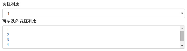
Selection box (Select)
When you want the user to choose from several options, but by default, can select an option, use the selection box.
- Use <select> Display a list of options, usually those who are familiar with the selection list, such as state or number.
- Usemultiple = "multiple"allows users to select multiple options.
The following example demonstrates both types (select and multiple):
Examples
<Form role = "form">
<Div class = "form-group">
<Label for = "name"> select list </ label>
<Select class = "form-control">
<Option> 1 </ option>
<Option> 2 </ option>
<Option> 3 </ option>
<Option> 4 </ option>
<Option> 5 </ option>
</ Select>
<Label Select List for = "name"> Multiple choice of </ label>
<Select multiple class = "form-control">
<Option> 1 </ option>
<Option> 2 </ option>
<Option> 3 </ option>
<Option> 4 </ option>
<Option> 5 </ option>
</ Select>
</ Div>
</ Form>
The results are as follows:
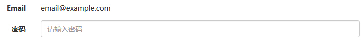
When you need to place plain text form in a horizontal form tag, please useclass.form-control-static in <p> on.
Examples
<Form class = "form-horizontal" role = "form">
<Div class = "form-group">
<Label class = "col-sm-2 control-label"> Email </ label>
<Div class = "col-sm-10 ">
<P class = "form-control-static ">
[email protected] </ p>
</ Div>
</ Div>
<Div class = "form-group">
<Label for = "inputPassword" class = "col-sm-2 control-label">
password </ label>
<Div class = "col-sm-10 ">
<Input type = "password" class = "form-control" id = "inputPassword" placeholder = "Please enter your password">
</ Div>
</ Div>
</ Form> The results are as follows:
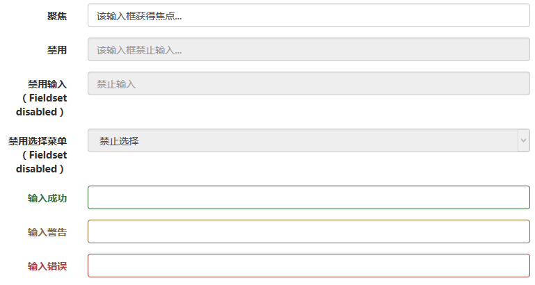
Inaddition: focusstate (that is, the user clicks on the input or use the tab key to focus on the input), Bootstrap also disable input box defines the style, and provides a form validation class.
Focus the input box
When receiving the input boxinput: focus,the contour input box will be removed, and application ofbox-shadow.
Disable input box input
If you want to disable an input box input, simply add thedisabledattribute, it will not only disable input box, but also change the input box styles, and when the mouse pointer hovers over the mouse pointer on the element style.
Disabled field set fieldset
On the <fieldset> add the disabled attribute to disable all controls <fieldset> inside.
Verification status
Bootstrap contains errors, warnings, and styles verification success message. Only the parent element simply add the appropriateclass (.has-warning, .has-erroror .has-success)can be used to verify the status.
The following example demonstrates all control state:
Examples
<Form class = "form-horizontal" role = "form">
<Div class = "form-group">
<Label class = "col-sm-2 control-label"> Focus </ label>
<Div class = "col-sm-10 ">
<Input class = "form-control" id = "focusedInput" type = "text" value = "input box to get the focus ...">
</ Div>
</ Div>
<Div class = "form-group">
<Label for = "inputPassword" class = "col-sm-2 control-label"> Disable </ label>
<Div class = "col-sm-10 ">
<Input class = "form-control" id = "disabledInput" type = "text" placeholder = "prohibit the importation of the input box ..." disabled>
</ Div>
</ Div>
<Fieldset disabled>
<Div class = "form-group">
<Label for = "disabledTextInput" class = "col-sm-2 control-label"> disable input (Fieldset disabled) </ label>
<Div class = "col-sm-10 ">
<Input type = "text" id = "disabledTextInput" class = "form-control" placeholder = "prohibit the importation">
</ Div>
</ Div>
<Div class = "form-group">
<Label for = "disabledSelect" class = "col-sm-2 control-label"> Disable selection menu (Fieldset disabled) </ label>
<Div class = "col-sm-10 ">
<Select id = "disabledSelect" class = "form-control">
<Option> Disable Selection </ option>
</ Select>
</ Div>
</ Div>
</ Fieldset>
<Div class = "form-group has- success">
<Label class = "col-sm-2 control-label" for = "inputSuccess"> input success </ label>
<Div class = "col-sm-10 ">
<Input type = "text" class = "form-control" id = "inputSuccess">
</ Div>
</ Div>
<Div class = "form-group has- warning">
<Label class = "col-sm-2 control-label" for = "inputWarning"> Enter Warning </ label>
<Div class = "col-sm-10 ">
<Input type = "text" class = "form-control" id = "inputWarning">
</ Div>
</ Div>
<Div class = "form-group has- error">
<Label class = "col-sm-2 control-label" for = "inputError"> typos </ label>
<Div class = "col-sm-10 ">
<Input type = "text" class = "form-control" id = "inputError">
</ Div>
</ Div>
</ Form>
The results are as follows:
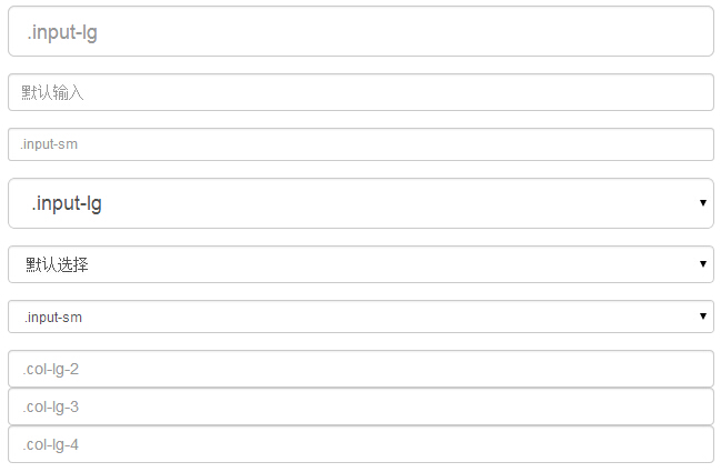
You can use eachclass.input-lg and.col-lg- *to set the form's height and width. The following example illustrates this point:
Examples
<Form role = "form">
<Div class = "form-group">
<Input class = "form-control input- lg" type = "text" placeholder = ".input-lg">
</ Div>
<Div class = "form-group">
<Input class = "form-control" type = "text" placeholder = "default input">
</ Div>
<Div class = "form-group">
<Input class = "form-control input- sm" type = "text" placeholder = ".input-sm">
</ Div>
<Div class = "form-group"> </ div>
<Div class = "form-group">
<Select class = "form-control input- lg">
<Option value = ""> .input-lg </ option>
</ Select>
</ Div>
<Div class = "form-group">
<Select class = "form-control">
<Option value = ""> default selection </ option>
</ Select>
</ Div>
<Div class = "form-group">
<Select class = "form-control input- sm">
<Option value = ""> .input-sm </ option>
</ Select>
</ Div>
<Div class = "row">
<Div class = "col-lg-2 ">
<Input type = "text" class = "form-control" placeholder = ".col-lg-2 ">
</ Div>
<Div class = "col-lg-3 ">
<Input type = "text" class = "form-control" placeholder = ".col-lg-3 ">
</ Div>
<Div class = "col-lg-4 ">
<Input type = "text" class = "form-control" placeholder = ".col-lg-4 ">
</ Div>
</ Div>
</ Form>
The results are as follows:
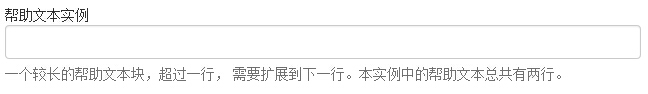
Bootstrap Forms control can have input in the input box on a block-level help text. In order to add up the entire width of a piece of content, in the <input> After using.help-block.The following example illustrates this point:
Examples
<Form role = "form">
<Span> Help text for instance </ span>
<Input class = "form-control" type = "text" placeholder = "">
<Span class = "help-block"> a long help text block, more than one line needs to be extended to the next line. In this example help text for a total of two lines. </ Span>
</ Form>
The results are as follows: