Bootstrap button group
Button group allows multiple buttons to be stacked on the same line. When you want to align the buttons together, which is very helpful. You can Bootstrap button (Button) plug-in to add an optional JavaScript check box and box style behavior.
The following table summarizes some of the important class Bootstrap using the buttons provided by the group:
| Class | 描述 | 代码示例 |
|---|
| .btn-group | 该 class 用于形成基本的按钮组。在.btn-group中放置一系列带有 class.btn的按钮。 |
<div class="btn-group">
  <button type="button" class="btn btn-default">Button1</button>
   <button type="button" class="btn btn-default">Button2</button>
</div>
|
| .btn-toolbar | 该 class 有助于把几组 <div class="btn-group"> 结合到一个 <div class="btn-toolbar"> 中,一般获得更复杂的组件。 |
<div class="btn-toolbar" role="toolbar">
  <div class="btn-group">...</div>
  <div class="btn-group">...</div>
</div>
|
| .btn-group-lg, .btn-group-sm, .btn-group-xs | 这些 class 可应用到整个按钮组的大小调整,而不需要对每个按钮进行大小调整。 |
<div class="btn-group btn-group-lg">...</div>
<div class="btn-group btn-group-sm">...</div>
<div class="btn-group btn-group-xs">...</div>
|
| .btn-group-vertical | 该 class 让一组按钮垂直堆叠显示,而不是水平堆叠显示。 |
<div class="btn-group-vertical">
  ...
</div>
|
The basic groups of buttons
The following example demonstrates the above table to discuss the use ofclass .btn-group:
Examples
<Div class = "btn-group">
<Button type = "button" class = "btn btn-default" > Button 1 </ button>
<Button type = "button" class = "btn btn-default" > button 2 </ button>
<Button type = "button" class = "btn btn-default" > button 3 </ button>
</ Div>
The results are as follows:
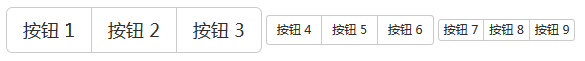
Button on the toolbar
The following example demonstrates the table above are discussed inclass .btn-toolbar to use:
Examples
<Div class = "btn-toolbar" role = "toolbar">
<Div class = "btn-group">
<Button type = "button" class = "btn btn-default" > Button 1 </ button>
<Button type = "button" class = "btn btn-default" > button 2 </ button>
<Button type = "button" class = "btn btn-default" > button 3 </ button>
</ Div>
<Div class = "btn-group">
<Button type = "button" class = "btn btn-default" > button 4 </ button>
<Button type = "button" class = "btn btn-default" > Button 5 </ button>
<Button type = "button" class = "btn btn-default" > button 6 </ button>
</ Div>
<Div class = "btn-group">
<Button type = "button" class = "btn btn-default" > buttons 7 </ button>
<Button type = "button" class = "btn btn-default" > button 8 </ button>
<Button type = "button" class = "btn btn-default" > button 9 </ button>
</ Div>
</ Div>
The results are as follows:
Size of the button
The following example demonstrates the above table discussion toclass .btn-group- * Use:
Examples
<Div class = "btn-group btn- group-lg">
<Button type = "button" class = "btn btn-default" > Button 1 </ button>
<Button type = "button" class = "btn btn-default" > button 2 </ button>
<Button type = "button" class = "btn btn-default" > button 3 </ button>
</ Div>
<Div class = "btn-group btn- group-sm">
<Button type = "button" class = "btn btn-default" > button 4 </ button>
<Button type = "button" class = "btn btn-default" > Button 5 </ button>
<Button type = "button" class = "btn btn-default" > button 6 </ button>
</ Div>
<Div class = "btn-group btn- group-xs">
<Button type = "button" class = "btn btn-default" > buttons 7 </ button>
<Button type = "button" class = "btn btn-default" > button 8 </ button>
<Button type = "button" class = "btn btn-default" > button 9 </ button>
</ Div>
The results are as follows:
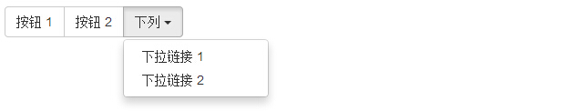
Nesting
You can nest another button button group within a group, that is, within a.btn-group nest another .btn-group.When you use a combination of a series of buttons and drop-down menus to make, this will be used.
Examples
<Div class = "btn-group">
<Button type = "button" class = "btn btn-default" > Button 1 </ button>
<Button type = "button" class = "btn btn-default" > button 2 </ button>
<Div class = "btn-group">
<Button type = "button" class = "btn btn-default dropdown -toggle" data-toggle = "dropdown"> these <span class = "caret"> </ span>
</ Button>
<Ul class = "dropdown-menu">
<Li> <a href = "#"> drop-down link 1 </ a> </ li >
<Li> <a href = "#"> drop-down link 2 </ a> </ li >
</ Ul>
</ Div>
</ Div>
The results are as follows:
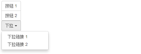
Vertical button group
The following example demonstrates the above table discussion toclass .btn-group-vertical use:
Examples
<Div class = "btn-group-vertical ">
<Button type = "button" class = "btn btn-default" > Button 1 </ button>
<Button type = "button" class = "btn btn-default" > button 2 </ button>
<Div class = "btn-group-vertical ">
<Button type = "button" class = "btn btn-default dropdown -toggle" data-toggle = "dropdown"> dropdown <span class = "caret"> </ span>
</ Button>
<Ul class = "dropdown-menu">
<Li> <a href = "#"> drop-down link 1 </ a> </ li >
<Li> <a href = "#"> drop-down link 2 </ a> </ li >
</ Ul>
</ Div>
</ Div>
The results are as follows: