Bootstrap pop-up box (Popover) widget
Pop-up box (Popover) tooltip (Tooltip) Similarly, there is provided an extended view. To activate the pop-up box, users simply hover over the element can be. The contents of the pop-up box can be completely filled using Bootstrap Data API (Bootstrap Data API). The method relies on a tool tip (tooltip).
If you want to refer to the individual plug-in features, you need to referencepopover.js, it depends on the tool tip (Tooltip) plug .Or, as Bootstrap plugin Overview chapter mentioned, you can refer tobootstrap.jsor compressed version ofbootstrap.min.js.
usage
Pop-up box (Popover) plug-generated content and tags on demand, is the default pop-up box (popover) behind their active elements. There are two ways you can add a pop-up box (popover):
- Through data attributes: To add a pop-up box (popover), just add data-toggle = "popover"to be an anchor / button labels. The title is the anchor pop-up box (popover) text. By default, the plug-in pop-up box (popover) is set at the top.
<a href="#" data-toggle="popover" title="Example popover">
	Please hover above me </a>
- By JavaScript: Enable pop-up box (popover) via JavaScript:
$ ( '# Identifier'). Popover (options)
Pop-up box (Popover) plug unlike the previous drop-down menus and other plug-ins discussed above, it is not a pure CSS plugin. To use this plugin, you must activate it using jquery (read javascript). Use the following script to enable all of the pages pop-up box (popover):
$ (Function () {. $ ( "[Data-toggle = 'popover']") popover ();});
Examples
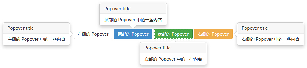
The following example demonstrates the use of pop-up box (Popover) widget by data attribute usage.
Examples
try it"
The results are as follows:
Options
There are some options through the Bootstrap Data API (Bootstrap Data API) or by adding JavaScript call. The following table lists these options:
| 选项名称 | 类型/默认值 | Data 属性名称 | 描述 |
|---|---|---|---|
| animation | boolean 默认值:true | data-animation | 向弹出框应用 CSS 褪色过渡效果。 |
| html | boolean 默认值:false | data-html | 向弹出框插入 HTML。如果为 false,jQuery 的 text 方法将被用于向 dom 插入内容。如果您担心 XSS 攻击,请使用 text。 |
| placement | string|function 默认值:top | data-placement | 规定如何定位弹出框(即 top|bottom|left|right|auto)。 当指定为auto时,会动态调整弹出框。例如,如果 placement 是 "auto left",弹出框将会尽可能显示在左边,在情况不允许的情况下它才会显示在右边。 |
| selector | string 默认值:false | data-selector | 如果提供了一个选择器,弹出框对象将被委派到指定的目标。 |
| title | string | function 默认值:'' | data-title | 如果未指定title属性,则 title 选项是默认的 title 值。 |
| trigger | string 默认值:'hover focus' | data-trigger | 定义如何触发弹出框: click| hover | focus | manual。您可以传递多个触发器,每个触发器之间用空格分隔。 |
| delay | number | object 默认值:0 | data-delay | 延迟显示和隐藏弹出框的毫秒数 - 对 manual 手动触发类型不适用。如果提供的是一个数字,那么延迟将会应用于显示和隐藏。如果提供的是对象,结构如下所示:
delay:
{ show: 500, hide: 100 } |
| container | string | false 默认值:false | data-container | 向指定元素追加弹出框。 实例: container: 'body' |
method
Here are some of the pop-up box (Popover) plug-in useful ways:
| 方法 | 描述 | 实例 |
|---|---|---|
| Options:.popover(options) | 向元素集合附加弹出框句柄。 |
$().popover(options) |
| Toggle:.popover('toggle') | 切换显示/隐藏元素的弹出框。 |
$('#element').popover('toggle')
|
| Show:.popover('show') | 显示元素的弹出框。 |
$('#element').popover('show')
|
| Hide:.popover('hide') | 隐藏元素的弹出框。 |
$('#element').popover('hide')
|
| Destroy:.popover('destroy') | 隐藏并销毁元素的弹出框。 |
$('#element').popover('destroy')
|
Examples
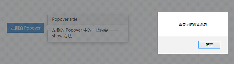
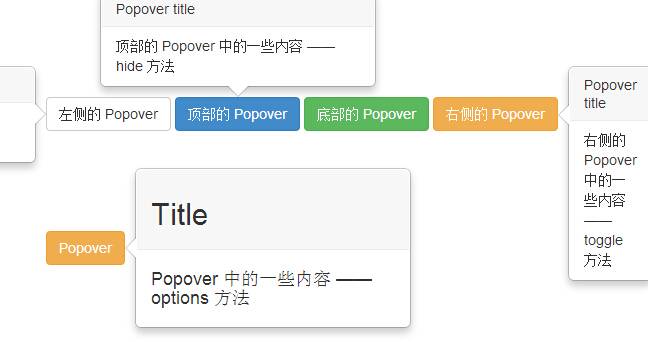
The following example demonstrates the pop-up box (Popover) plug-in approach:
Examples
try it"
The results are as follows:
event
The following table lists the pop-up box (Popover) plug-in to be used in the event. These events can be used when the hook function.
| 事件 | 描述 | 实例 |
|---|---|---|
| show.bs.popover | 当调用 show 实例方法时立即触发该事件。 |
$('#mypopover').on('show.bs.popover', function () {
  // 执行一些动作...
})
|
| shown.bs.popover | 当弹出框对用户可见时触发该事件(将等待 CSS 过渡效果完成)。 |
$('#mypopover').on('shown.bs.popover', function () {
  // 执行一些动作...
})
|
| hide.bs.popover | 当调用 hide 实例方法时立即触发该事件。 |
$('#mypopover').on('hide.bs.popover', function () {
  // 执行一些动作...
})
|
| hidden.bs.popover | 当工具提示对用户隐藏时触发该事件(将等待 CSS 过渡效果完成)。 |
$('#mypopover').on('hidden.bs.popover', function () {
  // 执行一些动作...
})
|
Examples
The following example demonstrates the pop-up box (Popover) widget events:
Examples
try it"
The results are as follows: