Bootstrap fold (Collapse) widget
Folding (Collapse) plug-ins can easily be folded so that area of the page. Whether you use it to create content or collapse the navigation panel, which allows a lot of content options.
If you want to refer to the individual plug-in features, you need to referencecollapse.js.At the same time, also you need to refer to your version of Bootstrap in Transition (transition) plug . Or, as Bootstrap plugin Overview chapter mentioned, you can refer tobootstrap.jsor compressed version ofbootstrap.min.js.
You can use the fold (Collapse) plug-in:
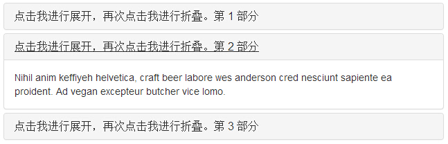
- Create a packet or collapsible accordion (accordion),as follows:
Examples
<Div class = "panel-group" id = "accordion"> <Div class = "panel panel-default" > <Div class = "panel-heading"> <H4 class = "panel-title"> <A data-toggle = "collapse" data-parent = "#accordion" href = "#collapseOne"> Click me are expanded, click I folded again. Part 1 </ a> </ H4> </ Div> <Div id = "collapseOne" class = "panel-collapse collapse in "> <Div class = "panel-body"> Nihil anim keffiyeh helvetica, craft beer labore wes anderson cred nesciunt sapiente ea proident. Ad vegan excepteur butcher vice lomo. </ div> </ Div> </ Div> <Div class = "panel panel-default" > <Div class = "panel-heading"> <H4 class = "panel-title"> <A data-toggle = "collapse" data-parent = "#accordion" href = "#collapseTwo"> Click me are expanded, click I folded again. Part 2 </ a> </ H4> </ Div> <Div id = "collapseTwo" class = "panel-collapse collapse" > <Div class = "panel-body"> Nihil anim keffiyeh helvetica, craft beer labore wes anderson cred nesciunt sapiente ea proident. Ad vegan excepteur butcher vice lomo. </ div> </ Div> </ Div> <Div class = "panel panel-default" > <Div class = "panel-heading"> <H4 class = "panel-title"> <A data-toggle = "collapse" data-parent = "#accordion" href = "#collapseThree"> Click me are expanded, click I folded again. Part 3 </ a> </ H4> </ Div> <Div id = "collapseThree" class = "panel-collapse collapse" > <Div class = "panel-body"> Nihil anim keffiyeh helvetica, craft beer labore wes anderson cred nesciunt sapiente ea proident. Ad vegan excepteur butcher vice lomo. </ div> </ Div> </ Div> </ Div>
try it"The results are as follows:
- data-toggle = "collapse" of the components added to the link you want to expand or collapse on.
- href or data-targetattribute to the parent component, its value isidsubcomponents.
- data-parent property to add accordion (accordion) to the id To expand or collapse the link assembly.
- Create a simple mark without accordion folding assembly (collapsible),as shown below:
Examples
<Button type = "button" class = "btn btn-primary" data-toggle = "collapse" data-target = "#demo"> simple folding assembly </ button> <Div id = "demo" class = "collapse in"> Nihil anim keffiyeh helvetica, craft beer labore wes anderson cred nesciunt sapiente ea proident. Ad vegan excepteur butcher vice lomo. </ div>
try it"The results are as follows:

As you can see in the example, we created a collapsible assemblies, and panel folding (accordion) different, we do not add the attributedata-parent.
usage
The following table lists the class fold (Collapse) plug-in for processing heavy retractable:
| Class | 描述 | 实例 |
|---|---|---|
| .collapse | 隐藏内容。 | 尝试一下 |
| .collapse.in | 显示内容。 | 尝试一下 |
| .collapsing | 当过渡效果开始时被添加,当过渡效果完成时被移除。 |
You can use the fold (Collapse) plug-in in two ways:
- Through data attributes: add data-toggle = "collapse"anddata-targetto element, automatic distribution control collapsible elements.data-target attribute accepts a CSS selector, and their applications will fold effect.Make sure to addclass .collapse collapsible elements.If you want it to be open by default, add an extraclass .in.
To add packet management similar to a collapsible accordion controls, add a data attributedata-parent = "# selector" .
- By JavaScript: to activate the collapse method JavaScript, as follows:
$ ( '. Collapse'). Collapse ()
Options
There are some options through data attributes or JavaScript to pass. The following table lists these options:
| 选项名称 | 类型/默认值 | Data 属性名称 | 描述 |
|---|---|---|---|
| parent | selector 默认值:false | data-parent | 如果提供了一个选择器,当可折叠项目显示时,指定父元素下的所有可折叠的元素将被关闭。这与创痛的折叠面板(accordion)的行为类似 - 这依赖于 accordion-group 类。 |
| toggle | boolean 默认值:true | data-toggle | 切换调用可折叠元素。 |
method
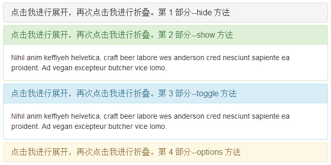
Here are some folded (Collapse) plug-in useful ways:
| 方法 | 描述 | 实例 |
|---|---|---|
| Options:.collapse(options) | 激活内容为可折叠元素。接受一个可选的 options 对象。 |
$('#identifier').collapse({
	toggle: false
})
|
| Toggle:.collapse('toggle') | 切换显示/隐藏可折叠元素。 |
$('#identifier').collapse('toggle')
|
| Show:.collapse('show') | 显示可折叠元素。 |
$('#identifier').collapse('show')
|
| Hide:.collapse('hide') | 隐藏可折叠元素。 |
$('#identifier').collapse('hide')
|
Examples
The following example demonstrates the method:
Examples
try it"
The results are as follows:
event
The following table lists the fold (Collapse) plug-in to be used in the event. These events can be used when the hook function.
| 事件 | 描述 | 实例 |
|---|---|---|
| show.bs.collapse | 在调用 show 方法后触发该事件。 |
$('#identifier').on('show.bs.collapse', function () {
	// 执行一些动作...
})
|
| shown.bs.collapse | 当折叠元素对用户可见时触发该事件(将等待 CSS 过渡效果完成)。 |
$('#identifier').on('shown.bs.collapse', function () {
	// 执行一些动作...
})
|
| hide.bs.collapse | 当调用 hide 实例方法时立即触发该事件。 |
$('#identifier').on('hide.bs.collapse', function () {
	// 执行一些动作...
})
|
| hidden.bs.collapse | 当折叠元素对用户隐藏时触发该事件(将等待 CSS 过渡效果完成)。 |
$('#identifier').on('hidden.bs.collapse', function () {
	// 执行一些动作...
})
|
Examples
The following example demonstrates the usage of the event:
Examples
try it"
The results are as follows: