Bootstrap Tool Tip (Tooltip) widget
When you want to describe a link, tool tips (Tooltip) is very helpful. Tooltip (Tooltip) plug-in is inspired byJason FramewrotejQuery.tipsysubject. Tooltip (Tooltip) plug-in has done a lot to improve, for example, does not depend on image instead use CSS to achieve animation effects, using data attribute information stored title.
If you want to refer to the individual plug-in features, you need to referencetooltip.js.Or, as Bootstrap plugin Overview chapter mentioned, you can refer tobootstrap.jsor compressed version ofbootstrap.min.js.
usage
Tooltip (Tooltip) plug-generated content and tags on demand, is the default tooltip (tooltip) on the back of their active elements. There are two ways you can add a tooltip (tooltip):
- Through data attributes: To add a tool tip (tooltip), just add data-toggle = "tooltip"to be an anchor tag. The title is the anchor tooltip (tooltip) text. By default, the plug-in tooltip (tooltip) is set at the top.
<a href="#" data-toggle="tooltip" title="Example tooltip"> please hover above me </a>
- By JavaScript: JavaScript is triggered by tooltip (tooltip):
$ ( '# Identifier'). Tooltip (options)
$ (Function () {$ ( "[data-toggle = 'tooltip']") tooltip ();.});
Examples
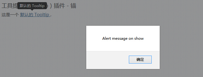
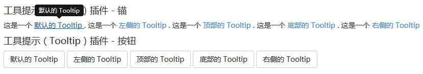
The following example demonstrates the use of tool tips (Tooltip) widget by data attribute usage.
Examples
try it"
The results are as follows:
Options
There are some options through the Bootstrap Data API (Bootstrap Data API) or by adding JavaScript call. The following table lists these options:
| 选项名称 | 类型/默认值 | Data 属性名称 | 描述 |
|---|---|---|---|
| animation | boolean 默认值:true | data-animation | 提示工具使用 CSS 渐变滤镜效果。 |
| html | boolean 默认值:false | data-html | 向提示工具插入 HTML。如果为 false,jQuery 的 text 方法将被用于向 dom 插入内容。如果您担心 XSS 攻击,请使用 text。 |
| placement | string|function 默认值:top | data-placement | 规定如何定位提示工具(即 top|bottom|left|right|auto)。 当指定为auto时,会动态调整提示工具。例如,如果 placement 是 "auto left",提示工具将会尽可能显示在左边,在情况不允许的情况下它才会显示在右边。 |
| selector | string 默认值:false | data-selector | 如果提供了一个选择器,提示工具对象将被委派到指定的目标。 |
| title | string | function 默认值:'' | data-title | 如果未指定title属性,则 title 选项是默认的 title 值。 |
| trigger | string 默认值:'hover focus' | data-trigger | 定义如何触发提示工具: click| hover | focus | manual。您可以传递多个触发器,每个触发器之间用空格分隔。 |
| content | string | function 默认值:'' | data-content | 如果未指定data-content属性,则使用默认的 content 值。 |
| delay | number | object 默认值:0 | data-delay | 延迟显示和隐藏提示工具的毫秒数 - 对 manual 手动触发类型不适用。如果提供的是一个数字,那么延迟将会应用于显示和隐藏。如果提供的是对象,结构如下所示:
delay:
{ show: 500, hide: 100 } |
| container | string | false 默认值:false | data-container | 向指定元素追加提示工具。 实例: container: 'body' |
method
Here are some tips tool (Tooltip) plug-in useful ways:
| 方法 | 描述 | 实例 |
|---|---|---|
| Options:.tooltip(options) | 向元素集合附加提示工具句柄。 |
$().tooltip(options) |
| Toggle:.tooltip('toggle') | 切换显示/隐藏元素的提示工具。 |
$('#element').tooltip('toggle')
|
| Show:.tooltip('show') | 显示元素的提示工具。 |
$('#element').tooltip('show')
|
| Hide:.tooltip('hide') | 隐藏元素的提示工具。 |
$('#element').tooltip('hide')
|
| Destroy:.tooltip('destroy') | 隐藏并销毁元素的提示工具。 |
$('#element').tooltip('destroy')
|
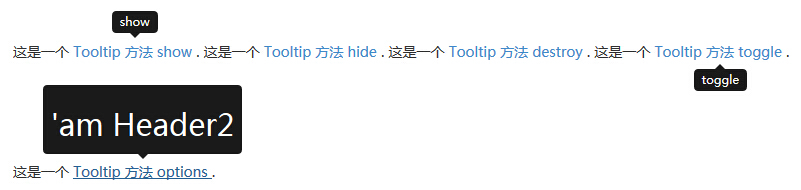
Examples
The following example demonstrates the tool tips (Tooltip) plug-in methods of usage.
Examples
try it"
The results are as follows:
event
The following table lists the tooltip (Tooltip) plug-in to be used in the event. These events can be used when the hook function.
| 事件 | 描述 | 实例 |
|---|---|---|
| show.bs.tooltip | 当调用 show 实例方法时立即触发该事件。 |
$('#myTooltip').on('show.bs.tooltip', function () {
  // 执行一些动作...
})
|
| shown.bs.tooltip | 当提示工具对用户可见时触发该事件(将等待 CSS 过渡效果完成)。 |
$('#myTooltip').on('shown.bs.tooltip', function () {
  // 执行一些动作...
})
|
| hide.bs.tooltip | 当调用 hide 实例方法时立即触发该事件。 |
$('#myTooltip').on('hide.bs.tooltip', function () {
  // 执行一些动作...
})
|
| hidden.bs.tooltip | 当提示工具对用户隐藏时触发该事件(将等待 CSS 过渡效果完成)。 |
$('#myTooltip').on('hidden.bs.tooltip', function () {
  // 执行一些动作...
})
|
Examples
The following example demonstrates the tool tips (Tooltip) plug-in event usage.
Examples
try it"
The results are as follows: