Bootstrap badge
This chapter will explain Bootstrap badges (Badges). Badges and tags similar, the main difference is that the badge more rounded corners.
Badges (Badges) is mainly used for new or unread items highlighted. To use the badge, just put<span class = "badge"> added to the link, Bootstrap navigation, etc. These elements can be.
The following example illustrates this point:
Examples
Show unread messages:
<A href = "#"> Mailbox < span class = "badge"> 50 < / span> </ a>
The results are as follows:
When there is no new or unread items, through theCSS: empty selector, badges will be folded, showing the inside empty.
Examples
Display unread disappear:
<Div class = "container">
<H2> badge </ h2>
<P> .badge class specifies the number of unread messages: </ p>
<P> <a href = "#"> Inbox <span class = "badge"> 21 < / span> </ a> </ p>
</ Div>
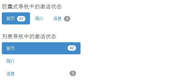
Activated navigation status
You can place a badge in an active state capsule navigation and list navigation. By using the<span class = "badge"> to activate the link, as shown in the following example:
Examples
<H4> capsule navigation active </ h4>
<Ul class = "nav nav-pills" >
<Li class = "active">
<A href = "#"> Home <span class = "badge"> 42 < / span>
</ A>
</ Li>
<Li>
<A href = "#"> Introduction </ a>
</ Li>
<Li>
<A href = "#"> news <span class = "badge"> 3 < / span>
</ A>
</ Li>
</ Ul>
<Br>
<H4> list of active navigation </ h4>
<Ul class = "nav nav-pills nav -stacked" style = "max-width: 260px ;">
<Li class = "active">
<A href = "#">
<Span class = "badge pull-right" > 42 </ span> Home </ a>
</ Li>
<Li>
<A href = "#"> Introduction </ a>
</ Li>
<Li>
<A href = "#">
<Span class = "badge pull-right" > 3 </ span> news </ a>
</ Li>
</ Ul>
The results are as follows: