Bootstrap input box group
Another feature of this chapter will explain Bootstrap support, input box group. Input box group expansion since form controls . Use the input box group, you can easily add a prefix and suffix text entry box, or button to the text-based.
By adding prefixes and suffixes to the content of the input field, you can add elements to the common user input. For example, you can add a dollar sign, or before the Twitter user name with @, or application programming interfaces required for other common elements.
To add to the prefix or suffix.form-control elements are as follows:
- The elements in a prefix or suffix with aclass .input-group of the <div> in.
- Next, in the same <div> inside, placing additional content in the class of.input-group-addon of <span> inside.
- To the <span> placed in front of or behind the <input> element.
 In order to maintain cross-browser compatibility, avoid using <select> element, because they do not completely render effects WebKit browser. Do not apply directly to the class group form input box set, input box group is an isolated component.
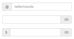
The basic input box set
The following example illustrates the basic input boxes Group:
Examples
<Div style = "padding: 100px 100px 10px ;">
<Form class = "bs-example bs- example-form" role = "form">
<Div class = "input-group">
<Span class = "input-group-addon "> @ </ span>
<Input type = "text" class = "form-control" placeholder = "twitterhandle">
</ Div>
<Br>
<Div class = "input-group">
<Input type = "text" class = "form-control">
<Span class = "input-group-addon "> .00 </ span>
</ Div>
<Br>
<Div class = "input-group">
<Span class = "input-group-addon "> $ </ span>
<Input type = "text" class = "form-control">
<Span class = "input-group-addon "> .00 </ span>
</ Div>
</ Form>
</ Div>
The results are as follows:
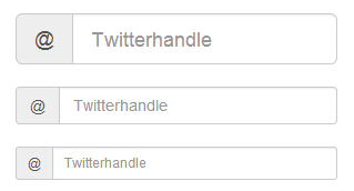
The size of the input box group
You can add a form relative to the size of the class.input-group (eg .input-group-lg, input-group-sm, input-group-xs) to change the size of the input box group. The contents of the input box will automatically be resized.
The following example illustrates this point:
Examples
<Div style = "padding: 100px 100px 10px ;">
<Form class = "bs-example bs- example-form" role = "form">
<Div class = "input-group input- group-lg">
<Span class = "input-group-addon "> @ </ span>
<Input type = "text" class = "form-control" placeholder = "Twitterhandle">
</ Div>
<Br>
<Div class = "input-group">
<Span class = "input-group-addon "> @ </ span>
<Input type = "text" class = "form-control" placeholder = "Twitterhandle">
</ Div>
<Br>
<Div class = "input-group input- group-sm">
<Span class = "input-group-addon "> @ </ span>
<Input type = "text" class = "form-control" placeholder = "Twitterhandle">
</ Div>
</ Form>
</ Div>
The results are as follows:
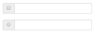
Check boxes and radio plug
You can check boxes and radio plug-in as a prefix or suffix element group input box, as shown in the following example:
Examples
<Div style = "padding: 100px 100px 10px ;">
<Form class = "bs-example bs- example-form" role = "form">
<Div class = "row">
<Div class = "col-lg-6 ">
<Div class = "input-group">
<Span class = "input-group-addon ">
<Input type = "checkbox"> </ span>
<Input type = "text" class = "form-control">
Input-group ->
->
<Br>
<Div class = "col-lg-6 ">
<Div class = "input-group">
<Span class = "input-group-addon ">
<Input type = "radio"> </ span>
<Input type = "text" class = "form-control">
Input-group ->
->
->
</ Form>
</ Div>
The results are as follows:
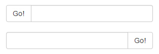
Button widget
You can also put the button as a prefix or suffix element of the input box group, this time you will not add.input-group-addon class, you need to use class.input-group-btn to wrap button. This is necessary because the default browser style will not be rewritten. The following example illustrates this point:
Examples
<Div style = "padding: 100px 100px 10px ;">
<Form class = "bs-example bs- example-form" role = "form">
<Div class = "row">
<Div class = "col-lg-6 ">
<Div class = "input-group">
<Span class = "input-group-btn ">
<Button class = "btn btn-default" type = "button"> Go! </ button>
</ Span>
<Input type = "text" class = "form-control">
Input-group ->
->
<Br>
<Div class = "col-lg-6 ">
<Div class = "input-group">
<Input type = "text" class = "form-control">
<Span class = "input-group-btn ">
<Button class = "btn btn-default" type = "button"> Go! </ button>
</ Span>
Input-group ->
->
->
</ Form>
</ Div>
The results are as follows:
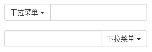
Button with dropdown menu
Add button with a drop-down menu in the input box group, simply in a.input-group-btn class of buttons and drop-down menus can be wrapped, as shown in the following examples:
Examples
<Div style = "padding: 100px 100px 10px ;">
<Form class = "bs-example bs- example-form" role = "form">
<Div class = "row">
<Div class = "col-lg-6 ">
<Div class = "input-group">
<Div class = "input-group-btn ">
<Button type = "button" class = "btn btn-default dropdown -toggle" data-toggle = "dropdown"> drop-down menu <span class = "caret"> </ span>
</ Button>
<Ul class = "dropdown-menu">
<Li>
<A href = "#"> function </ a>
</ Li>
<Li>
<A href = "#"> Another feature </ a>
</ Li>
<Li>
<A href = "#"> Other </ a>
</ Li>
<Li class = "divider"> </ li>
<Li>
<A href = "#"> isolated link </ a>
</ Li>
</ Ul>
Btn-group ->
<Input type = "text" class = "form-control">
Input-group ->
->
<Br>
<Div class = "col-lg-6 ">
<Div class = "input-group">
<Input type = "text" class = "form-control">
<Div class = "input-group-btn ">
<Button type = "button" class = "btn btn-default dropdown -toggle" data-toggle = "dropdown"> drop-down menu <span class = "caret"> </ span>
</ Button>
<Ul class = "dropdown-menu pull- right">
<Li>
<A href = "#"> function </ a>
</ Li>
<Li>
<A href = "#"> Another feature </ a>
</ Li>
<Li>
<A href = "#"> Other </ a>
</ Li>
<Li class = "divider"> </ li>
<Li>
<A href = "#"> isolated link </ a>
</ Li>
</ Ul>
Btn-group ->
Input-group ->
->
->
</ Form>
</ Div>
The results are as follows:
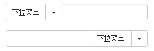
Segmentation drop-down menu button
Add split button with a drop-down menu in the input box group, use the drop-down menu button and roughly the same style, but the drop-down menu to add the main function, as shown in the following example:
Examples
<Div style = "padding: 100px 100px 10px ;">
<Form class = "bs-example bs- example-form" role = "form">
<Div class = "row">
<Div class = "col-lg-6 ">
<Div class = "input-group">
<Div class = "input-group-btn ">
<Button type = "button" class = "btn btn-default" tabindex = "-1"> drop-down menu </ button>
<Button type = "button" class = "btn btn-default dropdown -toggle" data-toggle = "dropdown" tabindex = "-1">
<Span class = "caret"> </ span>
<Span class = "sr-only"> switch drop-down menu </ span>
</ Button>
<Ul class = "dropdown-menu">
<Li>
<A href = "#"> function </ a>
</ Li>
<Li>
<A href = "#"> Another feature </ a>
</ Li>
<Li>
<A href = "#"> Other </ a>
</ Li>
<Li class = "divider"> </ li>
<Li>
<A href = "#"> isolated link </ a>
</ Li>
</ Ul>
Btn-group ->
<Input type = "text" class = "form-control">
Input-group ->
->
<Br>
<Div class = "col-lg-6 ">
<Div class = "input-group">
<Input type = "text" class = "form-control">
<Div class = "input-group-btn ">
<Button type = "button" class = "btn btn-default" tabindex = "-1"> drop-down menu </ button>
<Button type = "button" class = "btn btn-default dropdown -toggle" data-toggle = "dropdown" tabindex = "-1">
<Span class = "caret"> </ span>
<Span class = "sr-only"> switch drop-down menu </ span>
</ Button>
<Ul class = "dropdown-menu pull- right">
<Li>
<A href = "#"> function </ a>
</ Li>
<Li>
<A href = "#"> Another feature </ a>
</ Li>
<Li>
<A href = "#"> Other </ a>
</ Li>
<Li class = "divider"> </ li>
<Li>
<A href = "#"> isolated link </ a>
</ Li>
</ Ul>
Btn-group ->
Input-group ->
->
->
</ Form>
</ Div>
The results are as follows: