Bootstrap navigation
Navigation bar is a nice feature, is a prominent feature of Bootstrap site. Navigation Bar Foundation as a response components of the navigation page header in your application or site. In view of the mobile navigation device is folded, increases the available viewport width of the navigation bar will horizontally. Bootstrap core navigation bar, the navigation bar includes a domain name and basic navigation defined styles.
The default navigation bar
Create a default navigation bar, follow these steps:
- Tags addclass .navbar, .navbar-default to the <nav>.
- Addrole = "navigation" to the above elements, help to increase accessibility.
- Add a titleclass .navbar-header to the <div> element contains <a> internal elements with classnavbar-brand of. This will make the text appear larger One.
- To add a link to the navigation bar, simply add unordered list can withclass .nav, .navbar-nav's.
The following example illustrates this point:
Examples
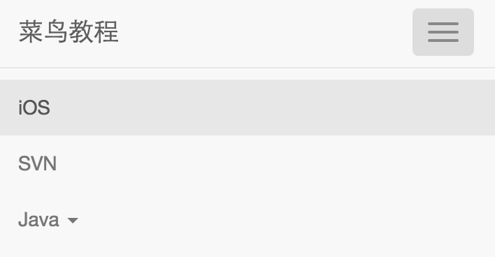
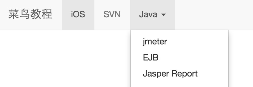
<Nav class = "navbar navbar-default" role = "navigation">
<Div class = "container-fluid">
<Div class = "navbar-header">
<A class = "navbar-brand" href = "#"> tutorial </ a>
</ Div>
<Div>
<Ul class = "nav navbar-nav" >
<Li class = "active"> <a href = "#"> iOS < / a> </ li>
<Li> <a href = "#"> SVN < / a> </ li>
<Li class = "dropdown">
<A href = "#" class = "dropdown-toggle" data-toggle = "dropdown"> Java <b class = "caret"> </ b>
</ A>
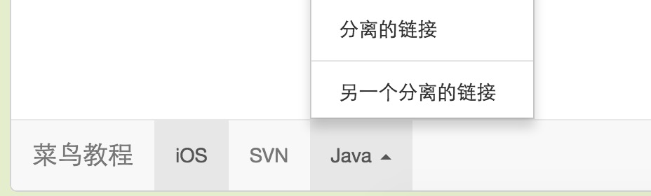
<Ul class = "dropdown-menu">
<Li> <a href = "#"> jmeter < / a> </ li>
<Li> <a href = "#"> EJB < / a> </ li>
<Li> <a href = "#"> Jasper Report </ a> </ li>
<Li class = "divider"> </ li>
<Li> <a href = "#"> isolated link </ a> </ li>
<Li class = "divider"> </ li>
<Li> <a href = "#"> another isolated link </ a> </ li>
</ Ul>
</ Li>
</ Ul>
</ Div>
</ Div>
</ Nav>
The results are as follows:
Responsive navigation bar
To add responsive navigation feature, you have to fold the content wrapped in withclasses .collapse, .navbar-collapse of the <div> in.Folded navigation bar is actually aclass .navbar-toggle button and two data- elements with.The first one is thedata-toggle, push button used to tell JavaScript needs to do, and the second is data-target,indicating to which you want to switch element. Three withclass .icon-bar of the <span> button to create the so-called Hamburg.These switches to.nav-collapse <div> element in.In order to achieve these functions, you must include Bootstrap fold (Collapse) plug .
The following example illustrates this point:
Examples
<Nav class = "navbar navbar-default" role = "navigation">
<Div class = "container-fluid">
<Div class = "navbar-header">
<Button type = "button" class = "navbar-toggle" data-toggle = "collapse"
data-target = "# example- navbar-collapse">
<Span class = "sr-only"> Switching the Navigation </ span>
<Span class = "icon-bar"> </ span>
<Span class = "icon-bar"> </ span>
<Span class = "icon-bar"> </ span>
</ Button>
<A class = "navbar-brand" href = "#"> tutorial </ a>
</ Div>
<Div class = "collapse navbar-collapse" id = "example-navbar-collapse ">
<Ul class = "nav navbar-nav" >
<Li class = "active"> <a href = "#"> iOS < / a> </ li>
<Li> <a href = "#"> SVN < / a> </ li>
<Li class = "dropdown">
<A href = "#" class = "dropdown-toggle" data-toggle = "dropdown"> Java <b class = "caret"> </ b>
</ A>
<Ul class = "dropdown-menu">
<Li> <a href = "#"> jmeter < / a> </ li>
<Li> <a href = "#"> EJB < / a> </ li>
<Li> <a href = "#"> Jasper Report </ a> </ li>
<Li class = "divider"> </ li>
<Li> <a href = "#"> isolated link </ a> </ li>
<Li class = "divider"> </ li>
<Li> <a href = "#"> another isolated link </ a> </ li>
</ Ul>
</ Li>
</ Ul>
</ Div>
</ Div>
</ Nav>
The results are as follows:
Form navigation bar
Form in the navigation bar instead of using Bootstrap form the default class chapters mentioned, it uses.navbar-form class.This ensures proper vertical alignment and form in a narrow viewport folding behavior. Use the alignment option (which will be explained in detail in the component alignment section) to determine the contents of the navigation bar is placed where.
The following example illustrates this point:
Examples
<Nav class = "navbar navbar-default" role = "navigation">
<Div class = "container-fluid">
<Div class = "navbar-header">
<A class = "navbar-brand" href = "#"> tutorial </ a>
</ Div>
<Div>
<Form class = "navbar-form navbar- left" role = "search">
<Div class = "form-group">
<Input type = "text" class = "form-control" placeholder = "Search">
</ Div>
<Button type = "submit" class = "btn btn-default" > Submit </ button>
</ Form>
</ Div>
</ Div>
</ Nav>
The results are as follows:
Button in the navigation bar
You can use theclass .navbar-btn add a button, the button is centered vertically on the navigation bar to not <form> The <button> element..navbar-btn can be used on <a> and <input> elements.
 Do not use.navbar-btn in .navbar-navon the <a> element, because it is not a standard Button, class .
The following example illustrates this point:
Examples
<Nav class = "navbar navbar-default" role = "navigation">
<Div class = "container-fluid">
<Div class = "navbar-header">
<A class = "navbar-brand" href = "#"> tutorial </ a>
</ Div>
<Div>
<Form class = "navbar-form navbar- left" role = "search">
<Div class = "form-group">
<Input type = "text" class = "form-control" placeholder = "Search">
</ Div>
<Button type = "submit" class = "btn btn-default" > submit button </ button>
</ Form>
<Button type = "button" class = "btn btn-default navbar -btn"> navigation bar button </ button>
</ Div>
</ Div>
</ Nav>
The results are as follows:
Text navigation bar
If you want to include in the text string navigation, useclass .navbar-text.This is often used in conjunction with the <p> tag to ensure proper leading and colors. The following example illustrates this point:
Examples
<Nav class = "navbar navbar-default" role = "navigation">
<Div class = "container-fluid">
<Div class = "navbar-header">
<A class = "navbar-brand" href = "#"> tutorial </ a>
</ Div>
<Div>
<P class = "navbar-text"> w3big User login </ p>
</ Div>
</ Div>
</ Nav>
The results are as follows:
Combined with icon navigation links
If you want to use in a conventional navigation bar navigation component icon, then use the icon to set theclass glyphicon glyphicon- *, more please see Bootstrap icon , as shown in the following example:
Examples
<Nav class = "navbar navbar-default" role = "navigation">
<Div class = "container-fluid">
<Div class = "navbar-header">
<A class = "navbar-brand" href = "#"> tutorial </ a>
</ Div>
<Ul class = "nav navbar-nav navbar -right">
<Li> <a href = "#"> <span class = "glyphicon glyphicon-user" > </ span> Register </ a> </ li>
<Li> <a href = "#"> <span class = "glyphicon glyphicon-log- in"> </ span> Login </ a> </ li>
</ Ul>
</ Div>
</ Nav>
The results are as follows:
Component Alignment
You can use the utilityclass .navbar-left or .navbar-rightor right to left aligned navigation barnavigation links, forms, buttons, or textthese components. Both add CSS class will float in the specified direction. The following example illustrates this point:
Examples
<Nav class = "navbar navbar-default" role = "navigation">
<Div class = "container-fluid">
<Div class = "navbar-header">
<A class = "navbar-brand" href = "#"> tutorial </ a>
</ Div>
<Div>
<Ul class = "nav navbar-nav navbar -left">
<Li class = "dropdown">
<A href = "#" class = "dropdown-toggle" data-toggle = "dropdown"> Java <b class = "caret"> </ b>
</ A>
<Ul class = "dropdown-menu">
<Li> <a href = "#"> jmeter < / a> </ li>
<Li> <a href = "#"> EJB < / a> </ li>
<Li> <a href = "#"> Jasper Report </ a> </ li>
<Li class = "divider"> </ li>
<Li> <a href = "#"> isolated link </ a> </ li>
<Li class = "divider"> </ li>
<Li> <a href = "#"> another isolated link </ a> </ li>
</ Ul>
</ Li>
</ Ul>
<Form class = "navbar-form navbar- left" role = "search">
<Button type = "submit" class = "btn btn-default" > Align Left - Submit Button </ button>
</ Form>
<P class = "navbar-text navbar- left"> Left Align - text </ p>
<Ul class = "nav navbar-nav navbar -right">
<Li class = "dropdown">
<A href = "#" class = "dropdown-toggle" data-toggle = "dropdown"> Java <b class = "caret"> </ b>
</ A>
<Ul class = "dropdown-menu">
<Li> <a href = "#"> jmeter < / a> </ li>
<Li> <a href = "#"> EJB < / a> </ li>
<Li> <a href = "#"> Jasper Report </ a> </ li>
<Li class = "divider"> </ li>
<Li> <a href = "#"> isolated link </ a> </ li>
<Li class = "divider"> </ li>
<Li> <a href = "#"> another isolated link </ a> </ li>
</ Ul>
</ Li>
</ Ul>
<Form class = "navbar-form navbar- right" role = "search">
<Button type = "submit" class = "btn btn-default" > Align Right - Submit Button </ button>
</ Form>
<P class = "navbar-text navbar- right"> Right Align - text </ p>
</ Div>
</ Div>
</ Nav>
The results are as follows:
Fixed to the top
Bootstrap navigation bar can be dynamically positioned. By default, it is a block-level element, which is based on the location of HTML placed in targeting. Through a number of helper classes, you can place it at the top or bottom of the page, or you can make it together with the page scrolling static navigation bar.
If you want the navigation bar fixed to the top of the page, addclass .navbar-fixed-top to .navbar class.The following example illustrates this point:
In order to prevent the top navigation bar and the body of the page content with other staggered, please add the tag of at least 50 pixels of padding to the <body> (padding), the value of the padding can be set according to your needs.
Examples
<Nav class = "navbar navbar-default navbar -fixed-top" role = "navigation">
<Div class = "container-fluid">
<Div class = "navbar-header">
<A class = "navbar-brand" href = "#"> tutorial </ a>
</ Div>
<Div>
<Ul class = "nav navbar-nav" >
<Li class = "active"> <a href = "#"> iOS < / a> </ li>
<Li> <a href = "#"> SVN < / a> </ li>
<Li class = "dropdown">
<A href = "#" class = "dropdown-toggle" data-toggle = "dropdown"> Java <b class = "caret"> </ b>
</ A>
<Ul class = "dropdown-menu">
<Li> <a href = "#"> jmeter < / a> </ li>
<Li> <a href = "#"> EJB < / a> </ li>
<Li> <a href = "#"> Jasper Report </ a> </ li>
<Li class = "divider"> </ li>
<Li> <a href = "#"> isolated link </ a> </ li>
<Li class = "divider"> </ li>
<Li> <a href = "#"> another isolated link </ a> </ li>
</ Ul>
</ Li>
</ Ul>
</ Div>
</ Div>
</ Nav>
The results are as follows:
Fixed in the end portion
If you want the navigation bar fixed to the bottom of the page, addclass .navbar-fixed-bottom to .navbar class.The following example illustrates this point:
Examples
<Nav class = "navbar navbar-default navbar -fixed-bottom" role = "navigation">
<Div class = "container-fluid">
<Div class = "navbar-header">
<A class = "navbar-brand" href = "#"> tutorial </ a>
</ Div>
<Div>
<Ul class = "nav navbar-nav" >
<Li class = "active"> <a href = "#"> iOS < / a> </ li>
<Li> <a href = "#"> SVN < / a> </ li>
<Li class = "dropdown">
<A href = "#" class = "dropdown-toggle" data-toggle = "dropdown"> Java <b class = "caret"> </ b>
</ A>
<Ul class = "dropdown-menu">
<Li> <a href = "#"> jmeter < / a> </ li>
<Li> <a href = "#"> EJB < / a> </ li>
<Li> <a href = "#"> Jasper Report </ a> </ li>
<Li class = "divider"> </ li>
<Li> <a href = "#"> isolated link </ a> </ li>
<Li class = "divider"> </ li>
<Li> <a href = "#"> another isolated link </ a> </ li>
</ Ul>
</ Li>
</ Ul>
</ Div>
</ Div>
</ Nav>
The results are as follows:
Static top
To be able to create together with the page scrolling navigation bar, add.navbar-static-top class.This class does not require the <body> add padding (padding).
Examples
<Nav class = "navbar navbar-default navbar -static-top" role = "navigation">
<Div class = "container-fluid">
<Div class = "navbar-header">
<A class = "navbar-brand" href = "#"> tutorial </ a>
</ Div>
<Div>
<Ul class = "nav navbar-nav" >
<Li class = "active"> <a href = "#"> iOS < / a> </ li>
<Li> <a href = "#"> SVN < / a> </ li>
<Li class = "dropdown">
<A href = "#" class = "dropdown-toggle" data-toggle = "dropdown"> Java <b class = "caret"> </ b>
</ A>
<Ul class = "dropdown-menu">
<Li> <a href = "#"> jmeter < / a> </ li>
<Li> <a href = "#"> EJB < / a> </ li>
<Li> <a href = "#"> Jasper Report </ a> </ li>
<Li class = "divider"> </ li>
<Li> <a href = "#"> isolated link </ a> </ li>
<Li class = "divider"> </ li>
<Li> <a href = "#"> another isolated link </ a> </ li>
</ Ul>
</ Li>
</ Ul>
</ Div>
</ Div>
</ Nav>
The results are as follows:
Invert the navigation bar
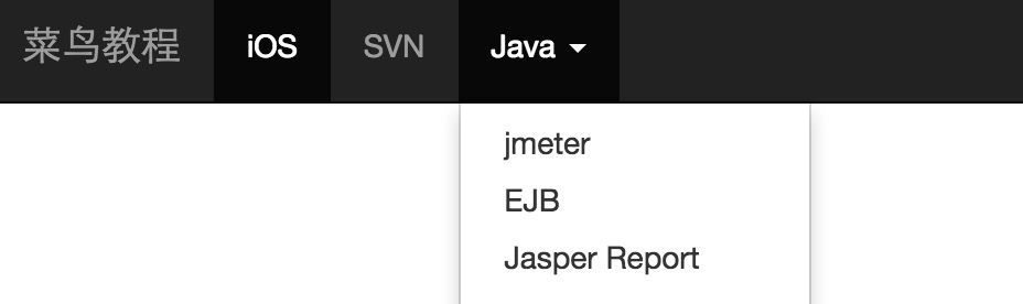
To create a navigation bar inverted black background with white text, and simply add to.navbar-inverse class to .navbar class,as shown in the following example:
In order to prevent the top navigation bar and the body of the page content with other staggered, please add the tag of at least 50 pixels of padding to the <body> (padding), the value of the padding can be set according to your needs.
Examples
<Nav class = "navbar navbar-inverse" role = "navigation">
<Div class = "container-fluid">
<Div class = "navbar-header">
<A class = "navbar-brand" href = "#"> tutorial </ a>
</ Div>
<Div>
<Ul class = "nav navbar-nav" >
<Li class = "active"> <a href = "#"> iOS < / a> </ li>
<Li> <a href = "#"> SVN < / a> </ li>
<Li class = "dropdown">
<A href = "#" class = "dropdown-toggle" data-toggle = "dropdown"> Java <b class = "caret"> </ b>
</ A>
<Ul class = "dropdown-menu">
<Li> <a href = "#"> jmeter < / a> </ li>
<Li> <a href = "#"> EJB < / a> </ li>
<Li> <a href = "#"> Jasper Report </ a> </ li>
<Li class = "divider"> </ li>
<Li> <a href = "#"> isolated link </ a> </ li>
<Li class = "divider"> </ li>
<Li> <a href = "#"> another isolated link </ a> </ li>
</ Ul>
</ Li>
</ Ul>
</ Div>
</ Div>
</ Nav>
The results are as follows: