Bootstrap button
This chapter will explain through examples how to use the Bootstrap button. Any element withclass .btn inherit the default appearance of rounded gray buttons.But Bootstrap provides options to define the style of the button, as shown in the following table specific:
The following styles can be used <a>, <button>, or the <input> element:
| class | description | Examples |
|---|
| .btn | Button to add basic styles | try it |
| .btn-default | Default / standard buttons | try it |
| .btn-primary | Original button style (not operating) | try it |
| .btn-success | It indicates successful action | try it |
| .btn-info | The style information may be used to eject button | try it |
| .btn-warning | He expressed the need for caution button | try it |
| .btn-danger | It represents a dangerous action button operation | try it |
| .btn-link | Let the button looks like a link (still retains button behavior) | try it |
| .btn-lg | Make a big button | try it |
| .btn-sm | Make a small button | try it |
| .btn-xs | Make a super small button | try it |
| .btn-block | Block-level button (stretched to 100% of the width of the parent element) | try it |
| .active | Button is clicked | try it |
| .disabled | Disable button | try it |
The following example demonstrates all of the above button class:
Examples
<Button type = "button" class = "btn btn-default" > Default button </ button>
<Button type = "button" class = "btn btn-primary" > Original Button </ button>
<Button type = "button" class = "btn btn-success" > Success Button </ button>
<Button type = "button" class = "btn btn-info" > Info button </ button>
<Button type = "button" class = "btn btn-warning" > Warning Button </ button>
<Button type = "button" class = "btn btn-danger" > dangerous Button </ button>
<Button type = "button" class = "btn btn-link" > Link Button </ button>
The results are as follows:
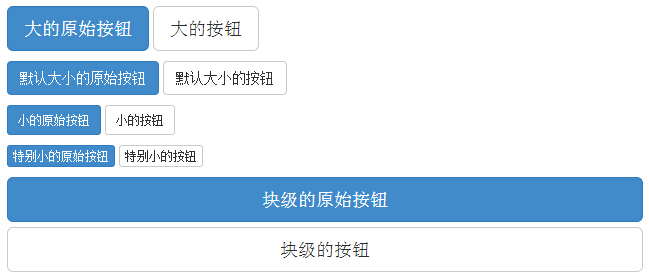
The following table lists the size of the button access to a variety of class:
| Class | 描述 |
|---|
| .btn-lg | 这会让按钮看起来比较大。 |
| .btn-sm | 这会让按钮看起来比较小。 |
| .btn-xs | 这会让按钮看起来特别小。 |
| .btn-block | 这会创建块级的按钮,会横跨父元素的全部宽度。 |
The following example demonstrates all of the above button class:
Examples
<P>
<Button type = "button" class = "btn btn-primary btn -lg"> large original buttons </ button>
<Button type = "button" class = "btn btn-default btn -lg"> big buttons </ button>
</ P>
<P>
<Button type = "button" class = "btn btn-primary" > The default size of the original Button </ button>
<Button type = "button" class = "btn btn-default" > The default size of the buttons </ button>
</ P>
<P>
<Button type = "button" class = "btn btn-primary btn -sm"> small original buttons </ button>
<Button type = "button" class = "btn btn-default btn -sm"> small buttons </ button>
</ P>
<P>
<Button type = "button" class = "btn btn-primary btn -xs"> Original particularly small buttons </ button>
<Button type = "button" class = "btn btn-default btn -xs"> particularly small buttons </ button>
</ P>
<P>
<Button type = "button" class = "btn btn-primary btn -lg btn-block"> block level original buttons </ button>
<Button type = "button" class = "btn btn-default btn -lg btn-block"> block level Button </ button>
</ P>
The results are as follows:
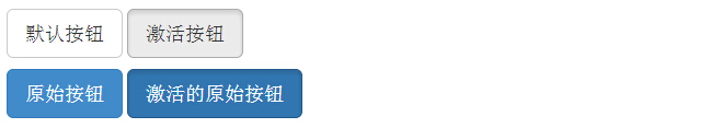
Bootstrap provides activation, class and other disabled button state, the following will be explained in detail.
Active
When the button is pressed to activate it will appear as the appearance (dark background, dark border, shadow).
The following table lists the elements to make buttons and anchor elements were active in class:
| 元素 | Class |
|---|
| 按钮元素 | 添加.activeclass 来显示它是激活的。 |
| 锚元素 | 添加 .activeclass 到 <a> 按钮来显示它是激活的。 |
The following example illustrates this point:
Examples
<P>
<Button type = "button" class = "btn btn-default btn -lg"> Default button </ button>
<Button type = "button" class = "btn btn-default btn -lg active"> activation button </ button>
</ P>
<P>
<Button type = "button" class = "btn btn-primary btn -lg"> Original Button </ button>
<Button type = "button" class = "btn btn-primary btn -lg active"> Activate the original buttons </ button>
</ P>
The results are as follows:
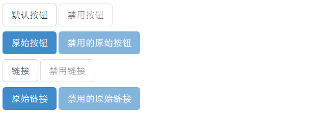
Disabled
When you disable a button, its color fades to 50%, and loss of gradient.
The following table lists the elements and the anchor element to make buttons are disabled if the class:
| 元素 | Class |
|---|
| 按钮元素 | 添加 disabled属性到 <button> 按钮。 |
| 锚元素 | 添加 disabledclass到 <a> 按钮。
注意:该 class 只会改变 <a> 的外观,不会改变它的功能。在这里,您需要使用自定义的 JavaScript 来禁用链接。 |
The following example illustrates this point:
Examples
<P>
<Button type = "button" class = "btn btn-default btn -lg"> Default button </ button>
<Button type = "button" class = "btn btn-default btn -lg" disabled = "disabled"> Disable Button </ button>
</ P>
<P>
<Button type = "button" class = "btn btn-primary btn -lg"> Original Button </ button>
<Button type = "button" class = "btn btn-primary btn -lg" disabled = "disabled"> Disable the original buttons </ button>
</ P>
<P>
<A href = "#" class = "btn btn-default btn -lg" role = "button"> link </ a>
<A href = "#" class = "btn btn-default btn -lg disabled" role = "button"> Disable link </ a>
</ P>
<P>
<A href = "#" class = "btn btn-primary btn -lg" role = "button"> original link </ a>
<A href = "#" class = "btn btn-primary btn -lg disabled" role = "button"> Disable the original link </ a>
</ P>
The results are as follows:
You can use the buttons on the class <a>, <button> or <input> elements. But it is recommended that you use the buttons on the class <button> element, to avoid cross-browser inconsistencies.
The following example illustrates this point:
Examples
<A class = "btn btn-default" href = "#" role = "button"> link </ a>
<Button class = "btn btn-default" type = "submit"> button </ button>
<Input class = "btn btn-default" type = "button" value = "input">
<Input class = "btn btn-default" type = "submit" value = "Submit">
The results are as follows: