Bootstrap tabs
This chapter will explain the features supported by the Bootstrap tab. Paging (Pagination), is an unordered list, Bootstrap treated like other interface elements as handles paging.
Paging (Pagination)
The following table lists the Bootstrap provide processing paging class.
| Class | 描述 | 示例代码 |
|---|---|---|
| .pagination | 添加该 class 来在页面上显示分页。 |
<ul class="pagination"> <li><a href="#">«</a></li> <li><a href="#">1</a></li> ....... </ul> |
| .disabled, .active | 您可以自定义链接,通过使用.disabled来定义不可点击的链接,通过使用.active来指示当前的页面。 |
<ul class="pagination"> <li class="disabled"><a href="#">«</a></li> <li class="active"><a href="#">1<span class="sr-only">(current)</span></a></li> ....... </ul> |
| .pagination-lg, .pagination-sm | 使用这些 class 来获取不同大小的项。 |
<ul class="pagination pagination-lg">...</ul> <ul class="pagination">...</ul> <ul class="pagination pagination-sm">...</ul> |
The default tab
The following example demonstrates the class table discussed.pagination usage:
Examples
try it"
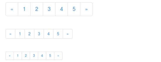
The results are as follows:

Paging status
The following example demonstratesclass .disabled discussed above table, .activeusage:
Examples
try it"
The results are as follows:

Page size
The following example demonstrates the class table discussed.pagination- * Usage:
Examples
try it"
The results are as follows:
Flip (Pager)
If you want to create a simple page links to provide users navigate through the page to achieve. And paging links as an unordered list is flip. By default, links are centered. The following table lists the Bootstrap processing flip class.
| Class | 描述 | 示例代码 |
|---|---|---|
| .pager | 添加该 class 来获得翻页链接。 |
<ul class="pager"> <li><a href="#">Previous</a></li> <li><a href="#">Next</a></li> </ul> |
| .previous, .next | 使用 class.previous把链接向左对齐,使用.next把链接向右对齐。 |
<ul class="pager"> <li class="previous"><a href="#">← Older</a></li> <li class="next"><a href="#">Newer →</a></li> </ul> |
| .disabled | 添加该 class 来获得一个颜色变淡的外观。 |
<ul class="pager"> <li class="previous disabled"><a href="#">← Older</a></li> <li class="next"><a href="#">Newer →</a></li> </ul> |
The default page
The following example demonstrates the class table discussed.pager usage:
Examples
try it"
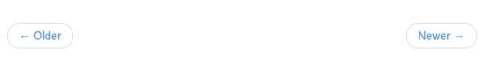
The results are as follows:

Aligned links
The following example demonstratesclass .previous discussed above table, .nextusage:
Examples
try it"
The results are as follows:
Flip state
The following example demonstrates the class table discussed.disabled usage:
Examples
try it"
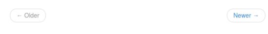
The results are as follows:
Further examples of pagination
| class | description | Examples |
|---|---|---|
| .pager | A simple pagination links, links centered. | try it |
| .previous | .pager the Previous button style, left justified | try it |
| .next | .pager the Next button style, right-aligned | try it |
| .disabled | Disable link | try it |
| .pagination | Paging links | try it |
| .pagination-lg | Larger paging links | try it |
| .pagination-sm | Smaller size of the paging links | try it |
| .disabled | Disable link | try it |
| .active | Current access page link style | try it |