Bootstrap modal box (Modal) widget
Modal Box (Modal) is overlaid on the parent form subform. Generally, the purpose is to show content from a single source, and can have some interaction without leaving the parent form. Subform can provide information, interaction and so on.
If you want to refer to the individual plug-in features, you need to referencemodal.js.Or, as Bootstrap plugin Overview chapter mentioned, you can refer tobootstrap.jsor compressed version ofbootstrap.min.js.
usage
You can switch the modal box hidden content (Modal) plug-in:
- Through data attributes: set the properties of data-toggle = "modal"in the controller elements (such as buttons or links) on, and setdata-target = "# identifier"orhref = "# identifier"to assign a specific mode to be switched state box (with id = "identifier").
- By JavaScript: Using this technique, you can by a simple line of JavaScript to call the modal box with id = "identifier" of:
$ ( '# Identifier'). Modal (options)
Examples
A static modal window instance, as shown in the following examples:
Examples
try it"
The results are as follows:
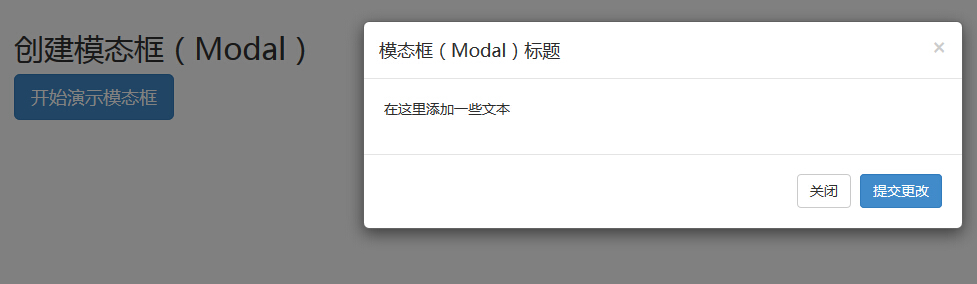
- Modal window, you need to have some kind of trigger. You can use the buttons or links. Here we are using a button.
- If you look closely at the above code, you will find in the <button>tag, data-target = "# myModal " is the goal that you want to load on a page modal box.You can create multiple modal box on the page, and then create different triggers for each of the modal box. Now, obviously, you can not load multiple modules at the same time, but you can create multiple loading at different times on the page.
- Modal box Two things to note:
- The first is.modal, for the <div> recognize content modal box.
- The second is.fade class.When the modal box is switched, it will cause the contents fade.
- aria-labelledby = "myModalLabel", the attribute references modal box title.
- Propertyaria-hidden = "true" for holding a modal window is not visible until the trigger is fired up (such as clicking on the relevant button).
- <Div class = "modal-header">, modal-header is defined head style modal window class.
- class = "close", close is a CSS class, modal window is used to set the style of the Close button.
- data-dismiss = "modal", HTML5 data attribute is a custom.Where it is used to close the modal window.
- class = "modal-body", is a CSS class Bootstrap CSS for the style set as the main modal window.
- class = "modal-footer", is a CSS class Bootstrap CSS for styling the bottom of the modal window.
- data-toggle = "modal", HTML5 custom data attribute data-toggle to open the modal window.
Options
There are some options that can be used to customize the modal window (Modal Window) look and feel, which are obtained by data attributes or JavaScript to pass. The following table lists these options:
| 选项名称 | 类型/默认值 | Data 属性名称 | 描述 |
|---|---|---|---|
| backdrop | boolean 或 string 'static' 默认值:true | data-backdrop | 指定一个静态的背景,当用户点击模态框外部时不会关闭模态框。 |
| keyboard | boolean 默认值:true | data-keyboard | 当按下 escape 键时关闭模态框,设置为 false 时则按键无效。 |
| show | boolean 默认值:true | data-show | 当初始化时显示模态框。 |
| remote | path 默认值:false | data-remote | 使用 jQuery.load方法,为模态框的主体注入内容。如果添加了一个带有有效 URL 的 href,则会加载其中的内容。如下面的实例所示:
<a data-toggle="modal" href="remote.html" data-target="#modal">请点击我</a> |
method
Here are some useful methods and modal () used together.
| 方法 | 描述 | 实例 |
|---|---|---|
| Options:.modal(options) | 把内容作为模态框激活。接受一个可选的选项对象。 |
$('#identifier').modal({
keyboard: false
})
|
| Toggle:.modal('toggle') | 手动切换模态框。 |
$('#identifier').modal('toggle')
|
| Show:.modal('show') | 手动打开模态框。 |
$('#identifier').modal('show')
|
| Hide:.modal('hide') | 手动隐藏模态框。 |
$('#identifier').modal('hide')
|
Examples
The following example demonstrates the method:
Examples
try it"
The results are as follows:
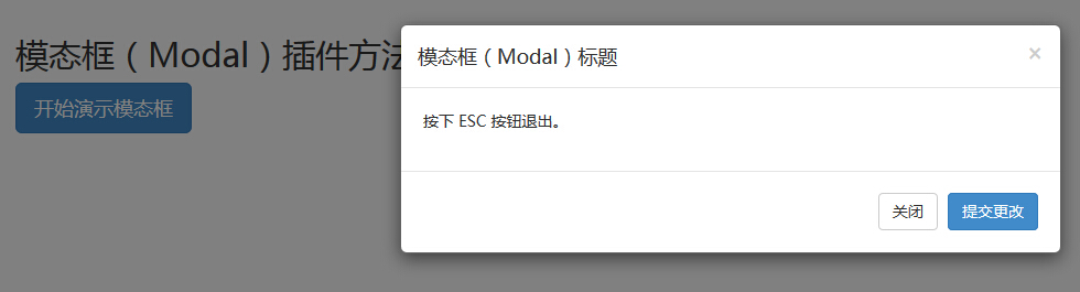
Just click ESC key, modal window is quit.
event
The following table lists the event to use the modal box. These events can be used when the hook function.
| 事件 | 描述 | 实例 |
|---|---|---|
| show.bs.modal | 在调用 show 方法后触发。 |
$('#identifier').on('show.bs.modal', function () {
  // 执行一些动作...
})
|
| shown.bs.modal | 当模态框对用户可见时触发(将等待 CSS 过渡效果完成)。 |
$('#identifier').on('shown.bs.modal', function () {
  // 执行一些动作...
})
|
| hide.bs.modal | 当调用 hide 实例方法时触发。 |
$('#identifier').on('hide.bs.modal', function () {
  // 执行一些动作...
})
|
| hidden.bs.modal | 当模态框完全对用户隐藏时触发。 |
$('#identifier').on('hidden.bs.modal', function () {
  // 执行一些动作...
})
|
Examples
The following example demonstrates the usage of the event:
Examples
try it"
The results are as follows:
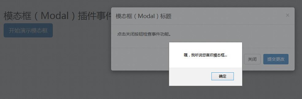
As shown in the above example, if you click on theclosebutton,hideevent, a warning message is displayed.