jQuery EasyUI layout widget - Panel Panel
 jQuery EasyUI plugin
 By $ .fn.panel.defaults override the default defaults.
Panel (panel) as other content containers. It is to create other components (such as: Layout layout, Tabs tabs / tab, Accordion folding panels, etc.) based components. It also provides built-in foldable, closed, to maximize, minimize behavior as well as other custom behavior. Panel (panel) can be easily embedded into any position on the page.
usage
Create panel (Panel)
1, the panel created by the mark (Panel)
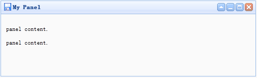
Create a tag from the panel (Panel) easier. Adding 'easyui-panel' class to the <div> tag.
<Div id = "p" class = "easyui-panel" title = "My Panel"
    style = "width: 500px; height: 150px; padding: 10px; background: #fafafa;"
    data-options = "iconCls: 'icon-save', closable: true,
    collapsible: true, minimizable: true, maximizable: true ">
    <P> panel content. </ P>
    <P> panel content. </ P>
</ Div>
2, create programming panel (Panel)
Let's create a panel with the top right corner of the toolbar (Panel).
<Div id = "p" style = "padding: 10px;">
    <P> panel content. </ P>
    <P> panel content. </ P>
</ Div>
$ ( '# P'). Panel ({
    width: 500,
    height: 150,
    title: 'My Panel',
    tools: [{
    iconCls: 'icon-add',
    handler: function () {alert ( 'new')}
    }, {
    iconCls: 'icon-save',
    handler: function () {alert ( 'save')}
    }]
});
Mobile Panel (Panel)
Call 'move' method the panel (Panel) to move to a new location.
$ ( '# P'). Panel ( 'move', {
    left: 100,
    top: 100
});
Loading Content
Let's load panel (panel) content via ajax and display messages when loading.
$ ( '# P'). Panel ({
    href: 'content_url.php',
    onLoad: function () {
		alert ( 'loaded successfully');
    }
});
Attributes
| 名称 | 类型 | 描述 | 默认值 |
|---|---|---|---|
| id | string | 面板(panel)的 id 属性。 | null |
| title | string | 显示在面板(panel)头部的标题文字。 | null |
| iconCls | string | 在面板(panel)里显示一个 16x16 图标的 CSS class。 | null |
| width | number | 设置面板(panel)的宽度。 | auto |
| height | number | 设置面板(panel)的高度。 | auto |
| left | number | 设置面板(panel)的左边位置。 | null |
| top | number | 设置面板(panel)的顶部位置。 | null |
| cls | string | 给面板(panel)添加一个 CSS class。 | null |
| headerCls | string | 给面板(panel)头部添加一个 CSS class。 | null |
| bodyCls | string | 给面板(panel)主体添加一个 CSS class。 | null |
| style | object | 给面板(panel)添加自定义格式的样式。 改变面板(panel)边框宽度的代码实例:
<div class="easyui-panel" style="width:200px;height:100px"
		data-options="style:{borderWidth:2}">
</div>
|
{} |
| fit | boolean | 当设置为 true 时,面板(panel)的尺寸就适应它的父容器。下面的实例演示了自动调整尺寸到它的父容器的最大内部尺寸的面板(panel)。
<div style="width:200px;height:100px;padding:5px"> <div class="easyui-panel" style="width:200px;height:100px" data-options="fit:true,border:false"> Embedded Panel </div> </div> |
false |
| border | boolean | 定义了是否显示面板(panel)的边框。 | true |
| doSize | boolean | 如果设置为 true,创建时面板(panel)就调整尺寸并做成布局。 | true |
| noheader | boolean | 如果设置为 true,面板(panel)的头部将不会被创建。 | false |
| content | string | 面板(panel)主体内容。 | null |
| collapsible | boolean | 定义是否显示折叠按钮。 | false |
| minimizable | boolean | 定义是否显示最小化按钮。 | false |
| maximizable | boolean | 定义是否显示最大化按钮。 | false |
| closable | boolean | 定义是否显示关闭按钮。 | false |
| tools | array,selector | 自定义工具组,可能的值: 1、数组,每个元素包含 iconCls 和 handler 两个属性。 2、选择器,指示工具组。 面板(panel)工具组可通过已存在 <div> 标签声明:
<div class="easyui-panel" style="width:300px;height:200px"
		title="My Panel" data-options="iconCls:'icon-ok',tools:'#tt'">
</div>
<div id="tt">
	<a href="#" class="icon-add" onclick="javascript:alert('add')"></a>
	<a href="#" class="icon-edit" onclick="javascript:alert('edit')"></a>
</div>
面板(panel)工具组可通过数组定义:
<div class="easyui-panel" style="width:300px;height:200px"
		title="My Panel" data-options="iconCls:'icon-ok',tools:[
				{
					iconCls:'icon-add',
					handler:function(){alert('add')}
				},{
					iconCls:'icon-edit',
					handler:function(){alert('edit')}
				}]">
</div>
|
[] |
| collapsed | boolean | 定义初始化面板(panel)是不是折叠的。 | false |
| minimized | boolean | 定义初始化面板(panel)是不是最小化的。 | false |
| maximized | boolean | 定义初始化面板(panel)是不是最大化的。 | false |
| closed | boolean | 定义初始化面板(panel)是不是关闭的。 | false |
| href | string | 一个 URL,用它加载远程数据并且显示在面板(panel)里。请注意,除非面板(panel)打开,否则内容不会被加载。这对创建一个惰性加载的面板(panel)很有用:
<div id="pp" class="easyui-panel" style="width:300px;height:200px"
		data-options="href='get_content.php',closed:true">
</div>
<a href="#" onclick="javascript:$('#pp').panel('open')">Open</a>
|
null |
| cache | boolean | 设置为 true 就缓存从 href 加载的面板(panel)内容。 | true |
| loadingMessage | string | 当加载远程数据时在面板(panel)里显示一条信息。 | Loading… |
| extractor | function | 定义如何从 ajax 响应中提取内容,返回提取的数据。
extractor: function(data){
	var pattern = /<body[^>]*>((.|[\n\r])*)<\/body>/im;
	var matches = pattern.exec(data);
	if (matches){
		return matches[1];	// only extract body content
	} else {
		return data;
	}
}
|
event
| 名称 | 参数 | 描述 |
|---|---|---|
| onLoad | none | 当远程数据被加载时触发。 |
| onBeforeOpen | none | 面板(panel)打开前触发,返回 false 就停止打开。 |
| onOpen | none | 面板(panel)打开后触发。 |
| onBeforeClose | none | 面板(panel)关闭前触发,返回 false 就取消关闭。下面声明的面板(panel)不会关闭。
<div class="easyui-panel" style="width:300px;height:200px;"
		title="My Panel" data-options="onBeforeClose:function(){return false}">
	The panel cannot be closed.
</div>
|
| onClose | none | 面板(panel)关闭后触发。 |
| onBeforeDestroy | none | 面板(panel)销毁前触发,返回false就取消销毁。 |
| onDestroy | none | 面板(panel)销毁后触发。 |
| onBeforeCollapse | none | 面板(panel)折叠前触发,返回false就停止折叠。 |
| onCollapse | none | 面板(panel)折叠后触发。 |
| onBeforeExpand | none | 面板(panel)展开前触发,返回false就停止展开。 |
| onExpand | none | 面板(panel)展开后触发。 |
| onResize | width, height | 面板(panel)调整尺寸后触发。 width:新的外部宽度 height:新的外部高度 |
| onMove | left,top | 面板(panel)移动后触发。 left:新的左边位置 top:新的顶部位置 |
| onMaximize | none | 窗口最大化后触发。 |
| onRestore | none | 窗口还原为它的原始尺寸后触发。 |
| onMinimize | none | 窗口最小化后触发。 |
method
| 名称 | 参数 | 描述 |
|---|---|---|
| options | none | 返回选项(options)属性(property)。 |
| panel | none | 返回外部面板(panel)对象。 |
| header | none | 返回面板(panel)头部对象。 |
| body | none | 返回面板(panel)主体对象。 |
| setTitle | title | 设置头部的标题文本。 |
| open | forceOpen | 当 forceOpen 参数设置为 true 时,就绕过 onBeforeOpen 回调函数打开面板(panel)。 |
| close | forceClose | 当 forceClose 参数设置为 true 时,就绕过 onBeforeClose 回调函数关闭面板(panel)。 |
| destroy | forceDestroy | 当 forceDestroy 参数设置为 true 时,就绕过 onBeforeDestroy 回调函数销毁面板(panel)。 |
| refresh | href | 刷新面板(panel)加载远程数据。如果分配了 'href' 参数,将重写旧的 'href' 属性。 代码实例:
// open a panel and then refresh its contents.
$('#pp').panel('open').panel('refresh');
// refresh contents with a new URL.
$('#pp').panel('open').panel('refresh','new_content.php');
|
| resize | options | 设置面板(panel)尺寸并做布局。Options 对象包含下列属性: width:新的面板(panel)宽度 height:新的面板(panel)宽度 left:新的面板(panel)左边位置 top:新的面板(panel)顶部位置 代码实例:
$('#pp').panel('resize',{
	width: 600,
	height: 400
});
|
| move | options | 移动面板(panel)到新位置。Options 对象包含下列属性: left:新的面板(panel)左边位置 top:新的面板(panel)顶部位置 |
| maximize | none | 面板(panel)适应它的容器的尺寸。 |
| minimize | none | 最小化面板(panel)。 |
| restore | none | 把最大化的面板(panel)还原为它原来的尺寸和位置。 |
| collapse | animate | 折叠面板(panel)主体。 |
| expand | animate | 展开面板(panel)主体。 |
jQuery EasyUI plugin