jQuery EasyUI layout widget - Layout Layout
 jQuery EasyUI plugin
 By $ .fn.layout.defaults override the default defaults.
Layout (layout) is a container with five regions (North north, south south, Eastern east, west and West Central center) of. The middle region of the panel is required, the edge region of the panel is optional. Each edge region of the panel can be resized by dragging the frame to be folded by clicking the trigger to collapse the panel. Layout (layout) can be nested, so users can create complex layouts.
rely
- panel
- resizable
usage
Create Layout (Layout)
1, create the layout (Layout) tags.
Add 'easyui-layout' class to the <div> tag.
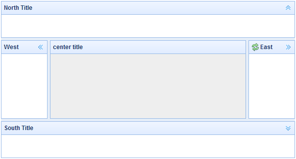
<Div id = "cc" class = "easyui-layout" style = "width: 600px; height: 400px;">
    <Div data-options = "region: 'north', title: 'North Title', split: true" style = "height: 100px;"> </ div>
    <Div data-options = "region: 'south', title: 'South Title', split: true" style = "height: 100px;"> </ div>
    <Div data-options = "region: 'east', title: 'East', split: true" style = "width: 100px;"> </ div>
    <Div data-options = "region: 'west', title: 'West', split: true" style = "width: 100px;"> </ div>
    <Div data-options = "region: 'center', title: 'center title'" style = "padding: 5px; background: #eee;"> </ div>
</ Div>
2, create the layout (Layout) on the entire page.
<Body class = "easyui-layout">
    <Div data-options = "region: 'north', title: 'North Title', split: true" style = "height: 100px;"> </ div>
    <Div data-options = "region: 'south', title: 'South Title', split: true" style = "height: 100px;"> </ div>
    <Div data-options = "region: 'east', title: 'East', split: true" style = "width: 100px;"> </ div>
    <Div data-options = "region: 'west', title: 'West', split: true" style = "width: 100px;"> </ div>
    <Div data-options = "region: 'center', title: 'center title'" style = "padding: 5px; background: #eee;"> </ div>
</ Body>
3, create a nested layout.
Note that the internal layout of the West End panels are folded.
<Body class = "easyui-layout">
    <Div data-options = "region: 'north'" style = "height: 100px"> </ div>
    <Div data-options = "region: 'center'">
		<Div class = "easyui-layout" data-options = "fit: true">
			<Div data-options = "region: 'west', collapsed: true" style = "width: 180px"> </ div>
			<Div data-options = "region: 'center'"> </ div>
		</ Div>
    </ Div>
</ Body>
4, load content via ajax.
Layout (layout) is based on the panel (panel) was created. Each area of the panel to provide built-in support for dynamic loading of content from URL. Use dynamic loading technology, users can make their page layout displayed faster.
<Body class = "easyui-layout">
    <Div data-options = "region: 'west', href: 'west_content.php'" style = "width: 180px"> </ div>
    <Div data-options = "region: 'center', href: 'center_content.php'"> </ div>
</ Body>
Folding panel layout (Collpase Layout Panel)
. $ ( '# Cc') layout ();
// Collapse the west panel
. $ ( '# Cc') layout ( 'collapse', 'west');
Button to add a tool by Western panel
$ ( '# Cc'). Layout ( 'add', {
    region: 'west',
    width: 180,
    title: 'West Title',
    split: true,
    tools: [{
		iconCls: 'icon-add',
		handler: function () {alert ( 'add')}
    }, {
		iconCls: 'icon-remove',
		handler: function () {alert ( 'remove')}
    }]
});
Layout Options (Layout Options)
| 名称 | 类型 | 描述 | 默认值 |
|---|---|---|---|
| fit | boolean | 当设置为 true 时,就设置布局(layout)的尺寸适应它的父容器。当在 'body' 标签上创建布局(layout)时,它将自动最大化到整个页面的全部尺寸。 | false |
Regional Panel Options (Region Panel Options)
Regional Panel Options (Region Panel Options) is defined in the panel (panel) component, the following are some common and new properties:
| 名称 | 类型 | 描述 | 默认值 |
|---|---|---|---|
| title | string | 布局面板(layout panel)的标题文本。 | null |
| region | string | 定义布局面板(layout panel)的位置,其值是下列之一:north、south、east、west、center。 | |
| border | boolean | 当设置为 true 时,就显示布局面板(layout panel)的边框。 | true |
| split | boolean | 当设置为 true 时,就显示拆分栏,用户可以用它改变面板(panel)的尺寸。 | false |
| iconCls | string | 在面板(panel)头部显示一个图标的 CSS class。 | null |
| href | string | 从远程站点加载数据的 URL 。 | null |
| collapsible | boolean | 定义是否显示可折叠按钮。 | true |
| minWidth | number | 面板(panel)最小宽度。 | 10 |
| minHeight | number | 面板(panel)最小高度。 | 10 |
| maxWidth | number | 面板(panel)最大宽度。 | 10000 |
| maxHeight | number | 面板(panel)最大高度。 | 10000 |
method
| 名称 | 参数 | 描述 |
|---|---|---|
| resize | none | 设置布局(layout)的尺寸。 |
| panel | region | 返回指定的面板(panel),'region' 参数可能的值是:'north'、'south'、'east'、'west'、'center'。 |
| collapse | region | 折叠指定的面板(panel),'region' 参数可能的值是:'north'、'south'、'east'、'west'。 |
| expand | region | 展开指定的面板(panel),'region' 参数可能的值是:'north'、'south'、'east'、'west'。 |
| add | options | 添加一个指定的面板(panel),options 参数一个配置对象,更多细节请参阅标签页面板(tab panel)属性。 |
| remove | region | 移除指定的面板(panel),'region' 参数可能的值:'north'、'south'、'east'、'west'。 |
jQuery EasyUI plugin