jQuery EasyUI layout widget - Accordion fold panel
 jQuery EasyUI plugin
 By $ .fn.accordion.defaults override the default defaults.
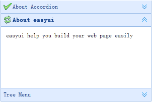
Folding panel (accordion) allows you to provide a plurality of panels (panel), while one or more display panels (panel). Each panel (panel) has expanded and built-in support collapsed. Click on the panel (panel) of the head to expand or collapse panels (panel) body. Panel (panel) content can be loaded via ajax designated 'href' attribute. User-definable selected panel (panel). If specified, the default is selected the first panel (panel).
rely
- panel
usage
Create folding panel (Accordion)
Created by marking folding panel (Accordion), add 'easyui-accordion' class to the <div> tag.
<Div id = "aa" class = "easyui-accordion" style = "width: 300px; height: 200px;">
    <Div title = "Title1" data-options = "iconCls: 'icon-save'" style = "overflow: auto; padding: 10px;">
		<H3 style = "color: # 0099FF;"> Accordion for jQuery </ h3>
		<P> Accordion is a part of easyui framework for jQuery.
		It lets you define your accordion component on web page more easily. </ P>
    </ Div>
    <Div title = "Title2" data-options = "iconCls: 'icon-reload', selected: true" style = "padding: 10px;">
		content2
    </ Div>
    <Div title = "Title3">
		content3
    </ Div>
</ Div>
We can change or re-folding panels (Accordion), the modification of certain properties.
$ ( '# Aa'). Accordion ({
    animate: false
});
Refresh folding panel (Accordion Panel) content
Call 'getSelected' method to get the current panel (panel), then we can call the panel (panel) of the 'refresh' method to load new content.
var pp = $ ( '# aa') accordion ( 'getSelected');. // get the selected panel (panel)
if (pp) {
    pp.panel ( 'refresh', 'new_content.php'); // call 'refresh' method to load new content}
Container Options
| 名称 | 类型 | 描述 | 默认值 |
|---|---|---|---|
| width | number | 折叠面板(Accordion)容器的宽度。 | auto |
| height | number | 折叠面板(Accordion)容器的高度。 | auto |
| fit | boolean | 设置为 true,就使折叠面板(Accordion)容器的尺寸适应它的父容器。 | false |
| border | boolean | 定义是否显示边框。 | true |
| animate | boolean | 定义当展开或折叠面板(panel)时是否显示动画效果。 | true |
| multiple | boolean | 设置为 true,则可同时展开多个面板(panel)。该属性自版本 1.3.5 起可用。 | false |
| selected | number | 初始化选中的面板(panel)索引。该属性自版本 1.3.5 起可用。 | 0 |
Panel (Panel) option
Folding panel (Accordion) panel (panel) options are inherited from the panel (panel), the following are additional attributes:
| 名称 | 类型 | 描述 | 默认值 |
|---|---|---|---|
| selected | boolean | 设置为 true 就展开面板(panel)。 | false |
| collapsible | boolean | 定义是否显示可折叠按钮。如果设置为 false,将不能通过点击来展开/折叠面板(panel)。 | true |
event
| 名称 | 参数 | 描述 |
|---|---|---|
| onSelect | title,index | 当面板(panel)被选中时触发。 |
| onUnselect | title,index | 当面板(panel)未被选中时触发。该事件自版本 1.3.5 起可用。 |
| onAdd | title,index | 当添加一个新面板(panel)时触发。 |
| onBeforeRemove | title,index | 当移除一个面板(panel)之前触发,返回 false 就取消移除动作。 |
| onRemove | title,index | 当移除一个面板(panel)时触发。 |
method
| 名称 | 参数 | 描述 |
|---|---|---|
| options | none | 返回折叠面板(accordion)的选项。 |
| panels | none | 获取全部的面板(panel)。 |
| resize | none | 调整折叠面板(accordion)的尺寸。 |
| getSelected | none | 获取第一个选中的面板(panel)。 |
| getSelections | none | 过去所有选中的面板(panel)。该方法自版本 1.3.5 起可用。 |
| getPanel | which | 获取指定的面板(panel)。'which' 参数可以是面板(panel)的标题(title)或索引(index)。 |
| getPanelIndex | panel | 获取指定的面板(panel)索引。该方法自版本 1.3 起可用。 下面的实例显示如何获取选中的面板(panel)索引。
var p = $('#aa').accordion('getSelected');
if (p){
	var index = $('#aa').accordion('getPanelIndex', p);
	alert(index);
}
|
| select | which | 选择指定的面板(panel)。'which' 参数可以是面板(panel)的标题(title)或索引(index)。 |
| unselect | which | 未选择指定的面板(panel)。'which' 参数可以是面板(panel)的标题(title)或索引(index)。该方法自版本 1.3.5 起可用。 |
| add | options | 添加一个新的面板(panel)。默认情况下,新添加的面板(panel)会被选中。如需添加一个未被选中的新面板(panel),请传递 'selected' 属性,并将其设置为 false。 代码实例:
$('#aa').accordion('add', {
	title: 'New Title',
	content: 'New Content',
	selected: false
});
|
| remove | which | 移除指定的面板(panel)。'which' 参数可以是面板(panel)的标题(title)或索引(index)。 |
jQuery EasyUI plugin