jQuery EasyUI data grid and tree widget - Tree Tree
 jQuery EasyUI plugin
 By $ .fn.tree.defaults override the default defaults.
Tree (tree) in the web page display data in a hierarchical tree structure. It provides users expand, collapse, drag, edit and asynchronous loading.
rely
- draggable
- droppable
usage
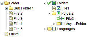
Tree (tree) is defined in the <ul> element. The tag can be defined leaf nodes and sub-nodes. Node is <li> ul element in the list. The following shows will be used for the production of elements nested within the ul element tree node.
<Ul id = "tt" class = "easyui-tree">
    <Li>
		<Span> Folder </ span>
		<Ul>
			<Li>
				<Span> Sub Folder 1 </ span>
				<Ul>
					<Li> <span> <a href="#"> File 11 </a> </ span> </ li>
					<Li> <span> File 12 </ span> </ li>
					<Li> <span> File 13 </ span> </ li>
				</ Ul>
			</ Li>
			<Li> <span> File 2 </ span> </ li>
			<Li> <span> File 3 </ span> </ li>
		</ Ul>
	</ Li>
    <Li> <span> File21 </ span> </ li>
</ Ul>
Tree (Tree) can also be defined in an empty <ul> element, you can use javascript to load data.
<Ul id = "tt"> </ ul>
$ ( '# Tt'). Tree ({
    url: 'tree_data.json'
});
Use loadFilter to handle json data from ASP.NET web service.
$ ( '# Tt'). Tree ({
    url: ...,
    loadFilter: function (data) {
		if (data.d) {
			return data.d;
		} Else {
			return data;
		}
    }
});
Tree data format (Tree Data Format)
Each node can include the following attributes:
- id: node id, it is important to load remote data.
- text: text to be displayed node.
- state: node status, 'open' or 'closed', the default is 'open'. When set to 'closed', the node has child nodes, and load them from a remote site.
- checked: Indicates whether the node is selected.
- attributes: a node to add custom attributes.
- children: defines the array of nodes child nodes.
Example:
[{
    "Id": 1,
    "Text": "Folder1",
    "IconCls": "icon-save",
    "Children": [{
		"Text": "File1",
		"Checked": true
    }, {
		"Text": "Books",
		"State": "open",
		"Attributes": {
			"Url": "/ demo / book / abc",
			"Price": 100
		},
		"Children": [{
			"Text": "PhotoShop",
			"Checked": true
		}, {
			"Id": 8,
			"Text": "Sub Bookds",
			"State": "closed"
		}]
    }]
}, {
    "Text": "Languages",
    "State": "closed",
    "Children": [{
		"Text": "Java"
    }, {
		"Text": "C #"
    }]
}]
Asynchronous tree
Built-in support for asynchronous loading tree mode, so users can create an empty tree, then specify a server-side dynamic returns JSON data, according to the demand for asynchronously populated tree. Here is an example:
<Ul class = "easyui-tree" data-options = "url: 'get_data.php'"> </ ul>
Tree by URL 'get_data.php' loaded. Child nodes depends on the parent node status is loaded. When you expand a closed node, if the node has no children loaded, it will send to the id value of the server node as http named 'id' request URL parameters defined above, in order to retrieve the child nodes.
Look at the data returned from the server:
[{
    "Id": 1,
    "Text": "Node 1",
    "State": "closed",
    "Children": [{
		"Id": 11,
		"Text": "Node 11"
    }, {
		"Id": 12,
		"Text": "Node 12"
    }]
}, {
    "Id": 2,
    "Text": "Node 2",
    "State": "closed"
}]
Nodes 1 and 2 are closed, when you expand a node, will showcase its child nodes directly. When you expand the node 2, the server will send the value (2) in order to retrieve the child nodes.
This tutorial to create an asynchronous trees demonstrate how to write code to the server according to the demand to return the tree data.
Attributes
| 名称 | 类型 | 描述 | 默认值 |
|---|---|---|---|
| url | string | 获取远程数据的 URL 。 | null |
| method | string | 检索数据的 http 方法(method)。 | post |
| animate | boolean | 定义当节点展开折叠时是否显示动画效果。 | false |
| checkbox | boolean | 定义是否在每个节点前边显示复选框。 | false |
| cascadeCheck | boolean | 定义是否级联检查。 | true |
| onlyLeafCheck | boolean | 定义是否只在叶节点前显示复选框。 | false |
| lines | boolean | 定义是否显示树线条。 | false |
| dnd | boolean | 定义是否启用拖放。 | false |
| data | array | 要加载的节点数据。
$('#tt').tree({
	data: [{
		text: 'Item1',
		state: 'closed',
		children: [{
			text: 'Item11'
		},{
			text: 'Item12'
		}]
	},{
		text: 'Item2'
	}]
});
|
null |
| formatter | function(node) | 定义如何呈现节点文本。 代码实例:
$('#tt').tree({
	formatter:function(node){
		return node.text;
	}
});
|
|
| loader | function(param,success,error) | 定义如何从远程服务器加载数据。返回 false 则取消该动作。该函数有下列参数: param:要传递到远程服务器的参数对象。 success(data):当检索数据成功时调用的回调函数。 error():当检索数据失败时调用的回调函数。 |
json loader |
| loadFilter | function(data,parent) | 返回要显示的过滤数据。返回数据时以标准树格式返回的。该函数有下列参数: data:要加载的原始数据。 parent:DOM 对象,表示父节点。 |
event
Many events require a callback function 'node' parameters, which include the following properties:
- id: bound to the identity value of the node.
- text: text to be displayed.
- iconCls: to display the icon css class.
- checked: whether the node is selected.
- state: node status, 'open' or 'closed'.
- attributes: bind to custom attribute node.
- target: DOM objects targets.
| 名称 | 参数 | 描述 |
|---|---|---|
| onClick | node | 当用户点击一个节点时触发。代码实例:
$('#tt').tree({
	onClick: function(node){
		alert(node.text);  // alert node text property when clicked
	}
});
|
| onDblClick | node | 当用户双击一个节点时触发。 |
| onBeforeLoad | node, param | 当加载数据的请求发出前触发,返回 false 则取消加载动作。 |
| onLoadSuccess | node, data | 当数据加载成功时触发。 |
| onLoadError | arguments | 当数据加载失败时触发,arguments 参数与 jQuery.ajax 的 'error' 函数一样。 |
| onBeforeExpand | node | 节点展开前触发,返回 false 则取消展开动作。 |
| onExpand | node | 当节点展开时触发。 |
| onBeforeCollapse | node | 节点折叠前触发,返回 false 则取消折叠动作。 |
| onCollapse | node | 当节点折叠时触发。 |
| onBeforeCheck | node, checked | 当用户点击复选框前触发,返回 false 则取消该选中动作。该事件自版本 1.3.1 起可用。 |
| onCheck | node, checked | 当用户点击复选框时触发。 |
| onBeforeSelect | node | 节点被选中前触发,返回 false 则取消选择动作。 |
| onSelect | node | 当节点被选中时触发。 |
| onContextMenu | e, node | 当右键点击节点时触发。代码实例:
// right click node and then display the context menu
$('#tt').tree({
	onContextMenu: function(e, node){
		e.preventDefault();
		// select the node
		$('#tt').tree('select', node.target);
		// display context menu
		$('#mm').menu('show', {
			left: e.pageX,
			top: e.pageY
		});
	}
});

// the context menu is defined as below:
<div id="mm" class="easyui-menu" style="width:120px;">
	<div onclick="append()" data-options="iconCls:'icon-add'">Append</div>
	<div onclick="remove()" data-options="iconCls:'icon-remove'">Remove</div>
</div>
|
| onBeforeDrag | node | 当节点的拖拽开始时触发,返回 false 则禁止拖拽。该事件自版本 1.3.2 起可用。 |
| onStartDrag | node | 当开始拖拽节点时触发。该事件自版本 1.3.2 起可用。 |
| onStopDrag | node | 当停止拖拽节点时触发。该事件自版本 1.3.2 起可用。 |
| onDragEnter | target, source | 当节点被拖拽进入某个允许放置的目标节点时触发,返回 false 则禁止放置。 target:被放置的目标节点元素。 source:被拖拽的源节点。 该事件自版本 1.3.2 起可用。 |
| onDragOver | target, source | 当节点被拖拽到允许放置的目标节点上时触发,返回 false 则禁止放置。 target:被放置的目标节点元素。 source:被拖拽的源节点。 该事件自版本 1.3.2 起可用。 |
| onDragLeave | target, source | 当节点被拖拽离开允许放置的目标节点时触发。 target:被放置的目标节点元素。 source:被拖拽的源节点。 该事件自版本 1.3.2 起可用。 |
| onBeforeDrop | target,source,point | 节点被放置之前触发,返回 false 则禁止放置。 target:DOM 对象,放置的目标节点。 source:源节点。 point:表示放置操作,可能的值是:'append'、'top' 或 'bottom'。 该事件自版本 1.3.2 起可用。 |
| onDrop | target,source,point | 当节点被放置时触发。
target:DOM 对象,放置的目标节点。 source:源节点。 point:表示放置操作,可能的值是:'append'、'top' 或 'bottom'。 |
| onBeforeEdit | node | 编辑节点前触发。 |
| onAfterEdit | node | 编辑节点后触发。 |
| onCancelEdit | node | 当取消编辑动作时触发。 |
method
| 名称 | 参数 | 描述 |
|---|---|---|
| options | none | 返回树的选项(options)。 |
| loadData | data | 加载树的数据。 |
| getNode | target | 获取指定的节点对象。 |
| getData | target | 获取指定的节点数据,包括它的子节点。 |
| reload | target | 重新加载树的数据。 |
| getRoot | none | 获取根节点,返回节点对象。 |
| getRoots | none | 获取根节点,返回节点数组。 |
| getParent | target | 获取父节点,target 参数表示节点的 DOM 对象。 |
| getChildren | target | 获取子节点, target 参数表示节点的 DOM 对象。 |
| getChecked | state | 获取选中的节点。状态可用值有:'checked'、'unchecked'、'indeterminate'。如果状态未分配,则返回 'checked' 节点。 代码实例:
var nodes = $('#tt').tree('getChecked');	// get checked nodes
var nodes = $('#tt').tree('getChecked', 'unchecked');	// get unchecked nodes
var nodes = $('#tt').tree('getChecked', 'indeterminate');	// get indeterminate nodes
var nodes = $('#tt').tree('getChecked', ['checked','indeterminate']);	// get checked and indeterminate nodes
|
| getSelected | none | 获取选中的节点并返回它,如果没有选中节点,则返回 null。 |
| isLeaf | target | 把指定的节点定义成叶节点,target 参数表示节点的 DOM 对象。 |
| find | id | 找到指定的节点并返回该节点对象。代码实例:
// find a node and then select it
var node = $('#tt').tree('find', 12);
$('#tt').tree('select', node.target);
|
| select | target | 选中一个节点,target 参数表示节点的 DOM 对象。 |
| check | target | 把指定节点设置为勾选。 |
| uncheck | target | 把指定节点设置为未勾选。 |
| collapse | target | 折叠一个节点,target 参数表示节点的 DOM 对象。 |
| expand | target | 展开一个节点,target 参数表示节点的 DOM 对象。当节点关闭且没有子节点时,节点的 id 值(名为 'id' 参数)将被发送至服务器以请求子节点数据。 |
| collapseAll | target | 折叠所有的节点。 |
| expandAll | target | 展开所有的节点。 |
| expandTo | target | 从根部展开一个指定的节点。 |
| scrollTo | target | 滚动到指定节点。该方法自版本 1.3.4 起可用。 |
| append | param | 追加一些子节点到一个父节点,param 参数有两个属性: parent:DOM 对象,要追加到的父节点,如果没有分配,则追加为根节点。 data:数组,节点的数据。 代码实例:
// append some nodes to the selected node
var selected = $('#tt').tree('getSelected');
$('#tt').tree('append', {
	parent: selected.target,
	data: [{
		id: 23,
		text: 'node23'
	},{
		text: 'node24',
		state: 'closed',
		children: [{
			text: 'node241'
		},{
			text: 'node242'
		}]
	}]
});
|
| toggle | target | 切换节点的展开/折叠状态,target 参数表示节点的 DOM 对象。 |
| insert | param | 在指定节点的前边或后边插入一个节点,param 参数包括下列属性: before:DOM 对象,前边插入的节点。 after:DOM 对象,后边插入的节点。 data:对象,节点数据。 下面的代码演示了如何在选中节点之前插入一个新的节点:
var node = $('#tt').tree('getSelected');
if (node){
	$('#tt').tree('insert', {
		before: node.target,
		data: {
			id: 21,
			text: 'node text'
		}
	});
}
|
| remove | target | 移除一个节点和它的子节点,target 参数表示节点的 DOM 对象。 |
| pop | target | 弹出一个节点和它的子节点,该方法和 remove 一样,但是返回了移除的节点数据。 |
| update | param | 更新指定的节点,'param' 参数有下列属性: target(DOM 对象,要被更新的节点)、id、text、iconCls、checked,等等。 代码实例:
// update the selected node text
var node = $('#tt').tree('getSelected');
if (node){
	$('#tt').tree('update', {
		target: node.target,
		text: 'new text'
	});
}
|
| enableDnd | none | 启用拖放功能。 |
| disableDnd | none | 禁用拖放功能。 |
| beginEdit | target | 开始编辑节点。 |
| endEdit | target | 结束编辑节点。 |
| cancelEdit | target | 取消编辑节点。 |
jQuery EasyUI plugin