jQuery EasyUI widget - Dialog Dialog
 jQuery EasyUI plugin
 Extended from $ .fn.window.defaults. By $ .fn.dialog.defaults override the default defaults.
Dialog (dialog) is a special type of window that has a toolbar at the top, at the bottom there is a button bar. By default, the dialog box (dialog) is only one tool in the right side of the head to close the display. Users can configure the behavior of the dialog box to display additional tools (such as: folding collapsible, can be minimized minimizable, to maximize maximizable, etc.).
rely
- window
- linkbutton
usage
By marking creates a dialog box (dialog) from an existing DOM node. The following example demonstrates a modal dialog with the adjustable size feature.
<Div id = "dd" class = "easyui-dialog" title = "My Dialog" style = "width: 400px; height: 200px;"
    data-options = "iconCls: 'icon-save', resizable: true, modal: true">
    Dialog Content.
</ Div>
Use javascript to create dialog boxes (dialog). Now let's create a modal dialog box, and then call 'refresh' method via ajax loading its contents.
<Div id = "dd"> Dialog Content. </ Div>
$ ( '# Dd'). Dialog ({
    title: 'My Dialog',
    width: 400,
    height: 200,
    closed: false,
    cache: false,
    href: 'get_content.php',
    modal: true
});
. $ ( '# Dd') dialog ( 'refresh', 'new_content.php');
Attributes
The property extends from the window (window) The following is a dialog box (dialog) rewriting properties.
| 名称 | 类型 | 描述 | 默认值 |
|---|---|---|---|
| title | string | 对话框的标题文本。 | New Dialog |
| collapsible | boolean | 定义是否显示折叠按钮。 | false |
| minimizable | boolean | 定义是否显示最小化按钮。 | false |
| maximizable | boolean | 定义是否显示最大化按钮。 | false |
| resizable | boolean | 定义对话框是否可调整尺寸。 | false |
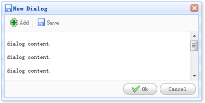
| toolbar | array,selector | 对话框的顶部工具栏,可能的值: 1、数组,每个工具的选项都与链接按钮(linkbutton)一样。 2、选择器,指示工具栏。 对话框工具栏可以在 <div>标签中声明: <div class="easyui-dialog" style="width:600px;height:300px" data-options="title:'My Dialog',toolbar:'#tb',modal:true"> Dialog Content. </div> <div id="tb"> <a href="#" class="easyui-linkbutton" data-options="iconCls:'icon-edit',plain:true"/a> <a href="#" class="easyui-linkbutton" data-options="iconCls:'icon-help',plain:true"/a> </div>对话框工具栏也可以通过数组定义:
<div class="easyui-dialog" style="width:600px;height:300px"
		data-options="title:'My Dialog',modal:true,
			toolbar:[{
				text:'Edit',
				iconCls:'icon-edit',
				handler:function(){alert('edit')}
			},{
				text:'Help',
				iconCls:'icon-help',
				handler:function(){alert('help')}
			}]">
	Dialog Content.
</div>
|
null |
| buttons | array,selector | 对话框的底部按钮,可能的值: 1、数组,每个按钮的选项都与链接按钮(linkbutton)一样。 2、选择器,指示按钮栏。 按钮可以在 <div>标签中声明: <div class="easyui-dialog" style="width:600px;height:300px" data-options="title:'My Dialog',buttons:'#bb',modal:true"> Dialog Content. </div> <div id="bb"> <a href="#" class="easyui-linkbutton">Save</a> <a href="#" class="easyui-linkbutton">Close</a> </div>按钮也可以通过数组定义:
<div class="easyui-dialog" style="width:600px;height:300px"
		data-options="title:'My Dialog',modal:true,
			buttons:[{
				text:'Save',
				handler:function(){...}
			},{
				text:'Close',
				handler:function(){...}
			}]">
	Dialog Content.
</div>
|
null |
event
The event extends from the panel (panel).
method
The methods extend from window (window), the following is a method for the dialog box (dialog) add.
| 名称 | 参数 | 描述 |
|---|---|---|
| dialog | none | 返回外部对话框(dialog)对象。 |
jQuery EasyUI plugin