jQuery EasyUI form plugin - Validatebox verification box
 jQuery EasyUI plugin
 By $ .fn.validatebox.defaults override the default defaults.
Verify box (validatebox) in order to validate form input fields and design. If the user enters an invalid value, it will change the background color, the icon displays a warning message and prompt. Verify box (validatebox) can be integrated with the form (form) plug-in, to prevent the submission of invalid field.
rely
- tooltip
usage
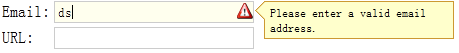
Create a verification mark from the box (validatebox).
<Input id = "vv" class = "easyui-validatebox" data-options = "required: true, validType: 'email'">
Create a validation using javascript box (validatebox).
<Input id = "vv">
$ ( '# Vv'). Validatebox ({
    required: true,
    validType: 'email'
});
Check the password and re-enter the same password.
// Extend the 'equals' rule
$ .extend ($. Fn.validatebox.defaults.rules, {
    equals: {
		validator: function (value, param) {
			return value == $ (param [0]) val ().;
		},
		message: 'Field do not match.'
    }
});
<Input id = "pwd" name = "pwd" type = "password" class = "easyui-validatebox" data-options = "required: true">
<Input id = "rpwd" name = "rpwd" type = "password" class = "easyui-validatebox"
    required = "required" validType = "equals [ '# pwd']">
Validation rules
Validation rules by using the required attributes to define and validType, here is the rules that have been implemented:
- email: email matching regular expression rules.
- url: URL matching regular expression rules.
- length [0,100]: Allows from x to y characters.
- remote [ 'http: //.../action.do','paramName']: send ajax request to verify the value of a successful return 'true'.
To customize the validation rules, rewrite $ .fn.validatebox.defaults.rules, to define a verification function and ineffective information. For example, the definition of a minLength Authentication Type:
$ .extend ($. Fn.validatebox.defaults.rules, {
    minLength: {
		validator: function (value, param) {
			return value.length> = param [0];
		},
		message: 'Please enter at least {0} characters.'
    }
});
Now you can use this type of authentication to define a minLength enter at least five characters in the input box:
<Input class = "easyui-validatebox" data-options = "validType: 'minLength [5]'">
Attributes
| 名称 | 类型 | 描述 | 默认值 |
|---|---|---|---|
| required | boolean | 定义是否字段应被输入。 | false |
| validType | string,array | 定义字段的验证类型,比如 email、url,等等。可能的值: 1、验证类型字符串,应用单个验证规则。 2、验证类型数组,应用多个验证规则。单个字段上的多个验证规则自版本 1.3.2 起可用。 代码实例: <input class="easyui-validatebox" data-options="required:true,validType:'url'"> <input class="easyui-validatebox" data-options=" required:true, validType:['email','length[0,20]'] "> |
null |
| delay | number | 延迟验证最后的输入值。该属性自版本 1.3.2 起可用。 | 200 |
| missingMessage | string | 当文本框为空时出现的提示文本。 | 该字段是必需的。 |
| invalidMessage | string | 当文本框的内容无效时出现的提示文本。 | null |
| tipPosition | string | 定义当文本框的内容无效时提示消息的位置。可能的值:'left'、'right'。该属性自版本 1.3.2 起可用。 | right |
| deltaX | number | 在 X 方向的提示偏移。该属性自版本 1.3.3 起可用。 | 0 |
| novalidate | boolean | 当设置为 true 时,则禁用验证。该属性自版本 1.3.4 起可用。 | false |
method
| 名称 | 参数 | 描述 |
|---|---|---|
| destroy | none | 移除并销毁该组件。 |
| validate | none | 进行验证以判定文本框的内容是否有效。 |
| isValid | none | 调用 validate 方法并且返回验证结果,true 或者 false。 |
| enableValidation | none | 启用验证。该方法自版本 1.3.4 起可用。 |
| disableValidation | none | 禁用验证。该方法自版本 1.3.4 起可用。 |
jQuery EasyUI plugin