CSS3 2D conversion
CSS3 Conversion
CSS3 transition, we can be moved, scaled, in turn, rotate and stretch elements.

How does it work?
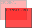
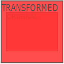
The effect of conversion, so that an element to change the shape, size and position.
You can convert your 2D or 3D elements.
Browser Support
Figures in the table represent the first browser to support the version number of the property.
Immediately following the digital -webkit-, -ms- or -moz- ago in support of the prefix attribute first browser version number.
| 属性 | |||||
|---|---|---|---|---|---|
| transform | 36.0 4.0 -webkit- |
10.0 9.0 -ms- |
16.0 3.5 -moz- |
3.2 -webkit- | 23.0 15.0 -webkit- 12.1 10.5 -o- |
| transform-origin (two-value syntax) |
36.0 4.0 -webkit- |
10.0 9.0 -ms- |
16.0 3.5 -moz- |
3.2 -webkit- | 23.0 15.0 -webkit- 12.1 10.5 -o- |
Internet Explorer 10, Firefox, and Opera support transform property.
Chrome and Safari requires the prefix -webkit- version.
Note: Internet Explorer 9 requires the prefix -ms- version.
2D conversion
In this chapter you will learn 2D conversion method:
- translate ()
- rotate ()
- scale ()
- skew ()
- matrix ()
In the next chapter you will learn 3D conversion.
Examples
try it"
translate () method
translate () method, according to the left (X axis) and the top (Y-axis) position of the given parameter, moves from the current position of the element.
Examples
try it"
translate value (50px, 100px) is a mobile element 50 pixels from the left, and moved 100 pixels from the top.
rotate () method
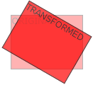
rotate () method, in a given number of degrees in a clockwise rotation of the elements. A negative value is allowed, this is counter-clockwise rotation of the elements.
Examples
try it"
rotate value (30deg) elements rotated 30 degrees clockwise.
scale () method
scale () method, which increase or decrease the size of the element, depending on the width (X axis) and height (Y axis) parameters:
Examples
try it"
scale (2,3) transition width is twice its original size, and three times the size of its original height.
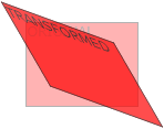
skew () method
skew () method, the element according to the transverse (X axis) and vertical (Y axis) line parameters for a given angle:
Examples
try it"
skew (30deg, 20deg) is an element of the X-axis and Y-axis about 20 degrees around 30 degrees.
matrix () method
matrix () method and the method of converting 2D merged into one.
matrix method has six parameters, including rotation, scaling, moving (panning) and tilt functions.
Examples
The use of matrix () method of rotating div element 30 °
try it"
New conversion property
Following is a list of all conversion properties:
| Property | description | CSS |
|---|---|---|
| transform | Apply 2D or 3D conversion element | 3 |
| transform-origin | It allows you to change the position of the conversion element | 3 |
2D conversion method
| function | description |
|---|---|
| matrix (n, n, n,n, n, n) | Define 2D conversion, using a matrix of six values. |
| translate(x, y) | 2D conversion is defined along the X and Y-axis moving elements. |
| translateX(n) | Define 2D conversion element along the X axis. |
| translateY(n) | 2D conversion is defined along the Y-axis moving elements. |
| scale(x, y) | Define 2D scale transformation, change the width and height of the element. |
| scaleX(n) | Define 2D scale transformation, change the width of the element. |
| scaleY(n) | Define 2D scale transformation, changing the height of the element. |
| rotate(angle) | Define 2D rotated a predetermined angle in the argument. |
| skew (x-angle, y-angle) | Define 2D skew transformation along the X and Y axes. |
| skewX(angle) | 2D skew transformation is defined, along the X axis. |
| skewY(angle) | Definition 2D skew transformation along the Y-axis. |