CSS3 Flexible Box
CSS3 Flexible Box is a new layout mode.
CSS3 Flexible Box (Flexible Box or flexbox), when the page is a need to adapt to different screen sizes and device types when elements have to ensure proper behavior layout.The purpose of introducing the flexible pouch layout model is to provide a more efficient way to arrange for a container sub-elements, alignment and distribution of the blank space.
Browser Support
Figures in the table represent the first browser to support the property version number.
Immediately after the number -webkit- browser or -moz- specified prefix.
| Attributes | |||||
|---|---|---|---|---|---|
| Basic support (Single-line flexbox) | 29.0 21.0 -webkit- | 11.0 | 22.0 18.0 -moz- | 6.1 -webkit- | 12.1 -webkit- |
| Multi-line flexbox | 29.0 21.0 -webkit- | 11.0 | 28.0 | 6.1 -webkit- | 17.0 15.0 -webkit- 12.1 |
CSS3 Flexible Box contents
Flexible box made of an elastic container (Flex container) and the elastic sub-elements (Flex item) components.
Elastic container by setting the display property is flex or inline-flex will be defined as the elastic container.
The elastic container contains one or more resilient sub-elements.
Note: the elastic outer container and the elastic element is a child of normal rendering. Flexible box defines only how resilient the child elements within the layout of the elastic container.
Flexible sub-element is usually displayed in the elastic line box. By default, each container is only one line.
The following shows the elastic element child elements are displayed in one line, left to right:
Examples
<Html>
<Head>
<Style>
.flex-container {
display: -webkit-flex;
display: flex;
width: 400px;
height: 250px;
background-color: lightgrey;
}
.flex-item {
background-color: cornflowerblue;
width: 100px;
height: 100px;
margin: 10px;
}
</ Style>
</ Head>
<Body>
<Div class = "flex-container">
<Div class = "flex-item"> flex item 1 </ div>
<Div class = "flex-item"> flex item 2 </ div>
<Div class = "flex-item"> flex item 3 </ div>
</ Div>
</ Body>
</ Html>
try it"
Of course, we can modify the arrangement.
If we set the direction property to rtl (right-to-left), the arrangement of the elastic sub-elements will change, change page layouts also followed:
Examples
direction: rtl;
}
.flex-container {
display: -webkit-flex;
display: flex;
width: 400px;
height: 250px;
background-color: lightgrey;
}
.flex-item {
background-color: cornflowerblue;
width: 100px;
height: 100px;
margin: 10px;
}
try it"
flex-direction
flex-direction order specifies the elastic sub-element in the parent container.
grammar
flex-direction: row | row-reverse | column | column-reverse
flex-direction values are:
- row: laterally from left to right (left), the default arrangement.
- row-reverse: reverse laterally aligned (right-justified, forward from the back row, the last one at the top.
- column: vertical arrangement.
- column-reverse: reverse vertical arrangement, from the back row forward, and finally a row at the top.
The following example illustrates the row-reverse use:
Examples
display: -webkit-flex;
display: flex;
-webkit-flex-direction: row-reverse;
flex-direction: row-reverse;
width: 400px;
height: 250px;
background-color: lightgrey;
}
The following example illustrates the column used:
Examples
display: -webkit-flex;
display: flex;
-webkit-flex-direction: column;
flex-direction: column;
width: 400px;
height: 250px;
background-color: lightgrey;
}
try it"
The following examples demonstrate the column-reverse use:
Examples
display: -webkit-flex;
display: flex;
-webkit-flex-direction: column-reverse;
flex-direction: column-reverse;
width: 400px;
height: 250px;
background-color: lightgrey;
}
try it"
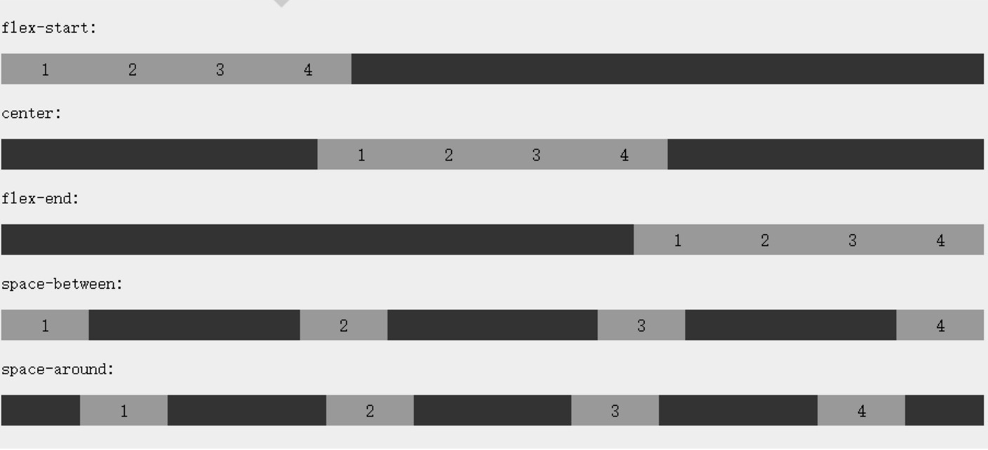
justify-content attribute
Content alignment (justify-content) on the elastic properties of the application container, the elastic elastic container items aligned along the main axis (main axis).
justify-content syntax is as follows:
justify-content: flex-start | flex-end | center | space-between | space-around
Each value analysis:
- flex-start:
Flexible project to the first line next to the filling. This is the default. The first main-start from the outside edges of the elastic item is placed in the main-start edges of the line, and the subsequent flush in turn placed an elastic term.
- flex-end:
Flexible project to the end of the line next to the filling. The first main-end items from outside the elastic threads are placed in main-end edges of the line, and the subsequent flush in turn placed an elastic term.
- center:
Flexible project centered next to fill. (If the remaining free space is negative, the project will also overflow elasticity in both directions).
- space-between:
Flexible project evenly distributed on the row. If the space is negative or only an elastic term, the value equivalent to the flex-start. Otherwise, main-start from the outside edges of the first row and an elastic item alignment, while main-end line and sideline margin last an elastic term alignment and distribution of the remaining items on the elastic line, adjacent equally spaced items.
- space-around:
Flexible project evenly distributed on the line, on both sides of the left half of the space. If the space is negative or only an elastic term, the value is equivalent to the center. Otherwise, the elasticity of the project along the distribution line and equally spaced from each other (for example, is 20px), while leaving half of the interval (1/2 * 20px = 10px) between the head and tail on both sides and elastic container.
Renderings show:
The following example demonstrates the flex-end use:
Examples
display: -webkit-flex;
display: flex;
-webkit-justify-content: flex-end;
justify-content: flex-end;
width: 400px;
height: 250px;
background-color: lightgrey;
}
try it"
The following example demonstrates the center 's use:
Examples
display: -webkit-flex;
display: flex;
-webkit-justify-content: center;
justify-content: center;
width: 400px;
height: 250px;
background-color: lightgrey;
}
try it"
The following examples demonstrate the space-between the use of:
Examples
display: -webkit-flex;
display: flex;
-webkit-justify-content: space-between;
justify-content: space-between;
width: 400px;
height: 250px;
background-color: lightgrey;
}
try it"
The following examples demonstrate the space-around use:
Examples
display: -webkit-flex;
display: flex;
-webkit-justify-content: space-around;
justify-content: space-around;
width: 400px;
height: 250px;
background-color: lightgrey;
}
try it"
align-items property
align-items set or retrieve the elastic element on the side of the box axis (vertical axis) direction of alignment.
grammar
align-items: flex-start | flex-end | center | baseline | stretch
Each value analysis:
- flex-start: the boundary side of the box element elastic axis (vertical axis) against the starting position of the axis of the live side of the starting line boundary.
- flex-end: elastic boundary side of the box element axis (vertical axis) against the starting position to live side shaft end of the line boundary.
- center: the elastic element box placed in the middle of the line-side axis (vertical axis) on. (If the size is smaller than the size of the elastic line of the box element, it is the same length in both directions overflow).
- baseline: box elements such as elastic inner shaft and side shaft line is the same, the value of 'flex-start' equivalent. In other cases, the value will be involved in baseline alignment.
- stretch: If the size of the margin box attribute specifies the size of the side of the shaft is 'auto', its value will be close to the line items as the size, but will follow the 'min / max-width / height' property limit.
The following example demonstrates stretch(默认值) the use of:
Examples
display: -webkit-flex;
display: flex;
-webkit-align-items: stretch;
align-items: stretch;
width: 400px;
height: 250px;
background-color: lightgrey;
}
try it"
The following example demonstrates the flex-start use:
Examples
display: -webkit-flex;
display: flex;
-webkit-align-items: flex-start;
align-items: flex-start;
width: 400px;
height: 250px;
background-color: lightgrey;
}
try it"
The following example demonstrates the flex-end use:
Examples
display: -webkit-flex;
display: flex;
-webkit-align-items: flex-end;
align-items: flex-end;
width: 400px;
height: 250px;
background-color: lightgrey;
}
try it"
The following example demonstrates the center 's use:
Examples
display: -webkit-flex;
display: flex;
-webkit-align-items: center;
align-items: center;
width: 400px;
height: 250px;
background-color: lightgrey;
}
try it"
The following example demonstrates the baseline usage:
Examples
display: -webkit-flex;
display: flex;
-webkit-align-items: baseline;
align-items: baseline;
width: 400px;
height: 250px;
background-color: lightgrey;
}
try it"
flex-wrap property
flex-wrap attribute is used to specify an elastic box child element wrap mode.
grammar
flex-flow: ||
Each value analysis:
- nowrap - By default, the elastic container as a single line.In this case resilient child may overflow container.
- wrap - elastic container multiple lines.Overflow portion of the resilient child is placed in this case to a new line, internal line break will occur subkey
- wrap-reverse - reverse wrap order.
The following example demonstrates the nowrap use:
Examples
display: -webkit-flex;
display: flex;
-webkit-flex-wrap: nowrap;
flex-wrap: nowrap;
width: 300px;
height: 250px;
background-color: lightgrey;
}
try it"
The following example demonstrates the wrap of use:
Examples
display: -webkit-flex;
display: flex;
-webkit-flex-wrap: wrap;
flex-wrap: wrap;
width: 300px;
height: 250px;
background-color: lightgrey;
}
try it"
The following example demonstrates the wrap-reverse use:
Examples
display: -webkit-flex;
display: flex;
-webkit-flex-wrap: wrap-reverse;
flex-wrap: wrap-reverse;
width: 300px;
height: 250px;
background-color: lightgrey;
}
try it"
align-content attribute
align-content attribute is used to modify the flex-wrap attribute behavior. Similar align-items , but it is not set the alignment of the elastic sub-elements, but set the alignment of each row.
grammar
align-content: flex-start | flex-end | center | space-between | space-around | stretch
Each value analysis:
-
stretch- default. Each line will stretch to occupy the remaining space. -
flex-start- rows of stacked boxes to the starting position of the elastic container. -
flex-end- rows of stacked boxes to the end position of the elastic container. -
center- rows of stacked boxes to the middle position of the elastic container. -
space-between- the flexible pouch container each row evenly distributed. -
space-around- each line in the flexible pouch container equally distributed between the two ends to retain half of sub-elements and sub-elements spacing size.
The following example demonstrates the center 's use:
Examples
display: -webkit-flex;
display: flex;
-webkit-flex-wrap: wrap;
flex-wrap: wrap;
-webkit-align-content: center;
align-content: center;
width: 300px;
height: 300px;
background-color: lightgrey;
}
try it"
Flexible sub-element attributes
Sequence
grammar
order:
Each value analysis:
- <Integer>: an integer value used to define the order in which the small value of the top surface. It can be negative.
order to set properties within the elastic properties of the elastic container child elements:
Examples
background-color: cornflowerblue;
width: 100px;
height: 100px;
margin: 10px;
}
.first {
-webkit-order: -1;
order: -1;
}
try it"
Align
Settings "margin" is "auto" value, automatically obtain the elastic container in the remaining space. So set the vertical margin value of "auto", it allows the elastic sub-elements are completely focused on the two-axis direction of the elastic container.
The following examples are on the first sub-elastic element set margin-right: auto; . The remaining space will be placed in the right elements:
Examples
background-color: cornflowerblue;
width: 75px;
height: 75px;
margin: 10px;
}
.flex-item: first-child {
margin-right: auto;
}
try it"
Perfect center
The following examples will be the perfect solution to the problems we usually encounter center.
Elastic box, center becomes very simple, just want to set the margin: auto; can make the elastic sub-elements in the axial direction on two perfectly centered:
Examples
background-color: cornflowerblue;
width: 75px;
height: 75px;
margin: auto;
}
try it"
align-self
align-self attribute is used to set the direction of alignment of the elastic element itself on the side of the axis (vertical axis).
grammar
align-self: auto | flex-start | flex-end | center | baseline | stretch
Each value analysis:
- auto: If the 'align-self' value 'auto', the calculated value of the element's parent element 'align-items' value, if it has no parent, the calculated value of the 'stretch'.
- flex-start: the boundary side of the box element elastic axis (vertical axis) against the starting position of the axis of the live side of the starting line boundary.
- flex-end: elastic boundary side of the box element axis (vertical axis) against the starting position to live side shaft end of the line boundary.
- center: the elastic element box placed in the middle of the line-side axis (vertical axis) on. (If the size is smaller than the size of the elastic line of the box element, it is the same length in both directions overflow).
- baseline: box elements such as elastic inner shaft and side shaft line is the same, the value of 'flex-start' equivalent. In other cases, the value will be involved in baseline alignment.
- stretch: If the size of the margin box attribute specifies the size of the side of the shaft is 'auto', its value will be close to the line items as the size, but will follow the 'min / max-width / height' property limit.
The following example demonstrates the elastic sub-elements align-self application effect of different values:
Examples
background-color: cornflowerblue;
width: 60px;
min-height: 100px;
margin: 10px;
}
.item1 {
-webkit-align-self: flex-start;
align-self: flex-start;
}
.item2 {
-webkit-align-self: flex-end;
align-self: flex-end;
}
.item3 {
-webkit-align-self: center;
align-self: center;
}
.item4 {
-webkit-align-self: baseline;
align-self: baseline;
}
.item5 {
-webkit-align-self: stretch;
align-self: stretch;
}
try it"
flex
flex attribute is used to specify how to allocate space for the elastic sub-elements.
grammar
flex:none | [ flex-grow ] || [ flex-shrink ] || [ flex-basis ]
Each value analysis:
- none: none calculate keyword is: 0 0 auto
- [Flex-grow]: definition of the elastic element box expansion ratio.
- [Flex-shrink]: definition of the elastic element box shrinkage ratio.
- [Flex-basis]: The default reference value defines the elastic element of the box.
The following example, a first sub-elastic element occupies 2/4 of the space, the other two each 1/4 Space:
Examples
background-color: cornflowerblue;
margin: 10px;
}
.item1 {
-webkit-flex: 2;
flex: 2;
}
.item2 {
-webkit-flex: 1;
flex: 1;
}
.item3 {
-webkit-flex: 1;
flex: 1;
}
try it"

More examples
Create a responsive page using an elastic box
CSS3 Flexible Box Properties
The following table lists commonly used to box in the elastic properties:
| Attributes | description |
|---|---|
| display | Specifies the HTML element box type. |
| flex-direction | Specify how to arrange the elements of neutron elastic container |
| justify-content | An elastic element in the spindle box (horizontal) direction of alignment. |
| align-items | An elastic element in the box side axis (vertical axis) the alignment direction. |
| flex-wrap | Whether an elastic wrap box sub-elements beyond the parent container. |
| align-content | Modify the behavior of flex-wrap property, similar to align-items, but not set the sub-elements are aligned, but the alignment of the line set |
| flex-flow | flex-direction and flex-wrap shorthand |
| order | An elastic box child element order. |
| align-self | Use the resilient child elements. Cover the container align-items property. |
| flex | How to set up an elastic box child element allocated space. |