Bootstrap inventory group / Price List
aims
Price is one of the main components of selling products or services to any site. Even Boortstrap 3 (and previous releases) did not provide a price list components directly, but it provides a list of the group components. The design of the components for the purpose of rendering complex customized content. Using this feature, we will create in this teaching in a simple price list and explain the production of a list of groups used by the CSS rules, and explains how to customize it.
Typical appearance
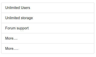
You can view online demo , the following are examples of code.
<Div class = "container">
<Div class = "row">
  <Ul class = "list-group col-lg-4">
  <Li class = "list-group-item"> Unlimited Users </ li>
  <Li class = "list-group-item"> Unlimited storage </ li>
  <Li class = "list-group-item"> Forum support </ li>
  <Li class = "list-group-item"> More .... </ li>
  <Li class = "list-group-item"> More ..... </ li>
</ Ul>
</ Div>
</ Div>
list-group and list-group-item
list-group class CSS rules as follows
.list-group {
  padding-left: 0;
  margin-bottom: 20px;
}

.list-group-item {
  position: relative;
  display: block;
  padding: 10px 15px;
  margin-bottom: -1px;
  background-color: #ffffff;
  border: 1px solid #dddddd;
}

.list-group-item: first-child {
  border-top-right-radius: 4px;
  border-top-left-radius: 4px;
}

.list-group-item: last-child {
  margin-bottom: 0;
  border-bottom-right-radius: 4px;
  border-bottom-left-radius: 4px;
}
Badge (badges)
You can use the badge (badges) components to include list-group. The following code demonstrates how to achieve this.
<Div class = "container">
<Div class = "row">
  <Ul class = "list-group col-lg-4">
  <Li class = "list-group-item"> <span class = "badge"> Very important </ span> Unlimited Users </ li>
  <Li class = "list-group-item"> Unlimited storage </ li>
  <Li class = "list-group-item"> Forum support </ li>
  <Li class = "list-group-item"> More .... </ li>
  <Li class = "list-group-item"> More ..... </ li>
</ Ul>
</ Div>
</ Div>
You can click here to view the online demo . The following shows the CSS code targeting badge list group.
.list-group-item> .badge {
  float: right;
}

.list-group-item> .badge + .badge {
  margin-right: 5px;
}
Please note that due to float: right, forces the century list of groups within the project content right.
Link Project
<Div class = "container">
<Div class = "row">
  <Div class = "list-group col-lg-4">
  <a href="#" class="list-group-item active">
    The pricing list
  </a>
  <a href="#" class="list-group-item"> Unlimited users </a>
  <a href="#" class="list-group-item"> Unlimited storage </a>
  <a href="#" class="list-group-item"> email support </a>
  <a href="#" class="list-group-item"> More ... </a>
</ Div>
</ Div>
</ Div>
You can click here to view the online demo . The following list shows the CSS code is located within the group of linked items.
a.list-group-item {
  color: # 555555;
}

a.list-group-item .list-group-item-heading {
  color: # 333333;
}

a.list-group-item: hover,
a.list-group-item: focus {
  text-decoration: none;
  background-color: # f5f5f5;
}

a.list-group-item.active,
a.list-group-item.active:hover,
a.list-group-item.active:focus {
  z-index: 2;
  color: #ffffff;
  background-color: # 428bca;
  border-color: # 428bca;
}

a.list-group-item.active .list-group-item-heading,
a.list-group-item.active:hover .list-group-item-heading,
a.list-group-item.active:focus .list-group-item-heading {
  color: inherit;
}

a.list-group-item.active .list-group-item-text,
a.list-group-item.active:hover .list-group-item-text,
a.list-group-item.active:focus .list-group-item-text {
  color: # e1edf7;
}
Custom Content
View online examples , this example demonstrates the list of groups with custom content. The following shows the appearance of the Bootstrap CSS in HTML and CSS code.
<Div class = "container">
<Div class = "row">
  <Div class = "list-group col-lg-4">
  <a href="#" class="list-group-item active">
    <H4 class = "list-group-item-heading"> List group item heading </ h4>
    <P class = "list-group-item-text"> ... </ p>
  </a>
</ Div>
</ Div>
</ Div>
CSS code
.list-group-item-heading {
  margin-top: 0;
  margin-bottom: 5px;
}

.list-group-item-text {
  margin-bottom: 0;
  line-height: 1.3;
}
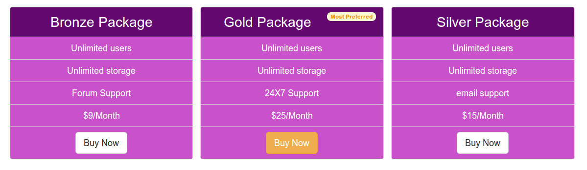
Price List
Now, we will take the section list group component of the structure, and convert it into a simple and attractive price list.
Here is a basic HTML contains the code that we used to create the price list. Please note that we have added a button in the last list item. For the leftmost and rightmost column, we used the default button Bootstrap. For the middle column, we add a button with a different class (warning), and make it look different. In addition, the first list item we are still in the middle column added a badge.
<! DOCTYPE html>
<Html>
  <Head>
    <Title> Bootstrap 101 template </ title>
    <Meta name = "viewport" content = "width = device-width, initial-scale = 1.0">
    <-! Bootstrap ->
    <Link href = "dist / css / bootstrap.min.css" rel = "stylesheet" media = "screen"> <-! HTML5 Shim and Respond.js IE8 support of HTML5 elements and media queries ->
    <- WARNING:! Respond.js does not work if you view the page via file: // ->
    <-! [If lt IE 9]>
      <Script src = "https://oss.maxcdn.com/libs/html5shiv/3.7.0/html5shiv.js"> </ script>
      <Script src = "https://oss.maxcdn.com/libs/respond.js/1.3.0/respond.min.js"> </ script>
    <! [Endif] ->
  </ Head>
  <Body>
  <Div class = "container">
  <Div class = "row">
  <Ul class = "list-group col-lg-4">
  <Li class = "list-group-item"> Bronze Package </ li>
  <Li class = "list-group-item"> Unlimited users </ li>
  <Li class = "list-group-item"> Unlimited storage </ li>
  <Li class = "list-group-item"> Forum Support </ li>
  <Li class = "list-group-item"> $ 9 / Month </ li>
  <Li class = "list-group-item"> <a href="#"> <button class = "btn btn-lg btn-default"> Buy Now </ button> </a> </ li>
</ Ul>
<-! Second ->
<Ul class = "list-group col-lg-4">
  <Li class = "list-group-item"> Gold Package <span class = "badge"> Most Preferred </ span> </ li>
  <Li class = "list-group-item"> Unlimited users </ li>
  <Li class = "list-group-item"> Unlimited storage </ li>
  <Li class = "list-group-item"> 24X7 Support </ li>
  <Li class = "list-group-item"> $ 25 / Month </ li>
  <Li class = "list-group-item"> <a href="#"> <button class = "btn btn-warning btn-lg"> Buy Now </ button> </a> </ li>
</ Ul>
<-! Third ->
<Ul class = "list-group col-lg-4">
  <Li class = "list-group-item"> Silver Package </ li>
  <Li class = "list-group-item"> Unlimited users </ li>
  <Li class = "list-group-item"> Unlimited storage </ li>
  <Li class = "list-group-item"> email support </ li>
  <Li class = "list-group-item"> $ 15 / Month </ li>
  <Li class = "list-group-item"> <a href="#"> <button class = "btn btn-lg btn-default"> Buy Now </ button> </a> </ li>
</ Ul>
</ Div>
</ Div>
    <-! JQuery (a JavaScript plugin for Bootstrap is necessary --->
    <Script src = "https://code.jquery.com/jquery.js"> </ script>
    <! - Include all of the compiled plug-in (see below), or if necessary, include a single file ->
    <Script src = "dist / js / bootstrap.min.js"> </ script>
  </ Body>
</ Html>
Now, we will add the CSS class directly customize the look and feel. The first fragment CSS code will add some padding to the top of the page.
body {
  padding-top: 70px
  }
Then, by adding the following CSS code, we will customize the background color, font color, text alignment and font size of the list of items.
ul.list-group.col-lg-4> li {
  background-color: # c952ca;
  color: white;
  text-align: center;
  font-size: 125%;
  }
But if we want the center column of the first list item look different, we need to add the following CSS code. We use the: first-child pseudo-element to access the required list item.
ul.list-group.col-lg-4> li.list-group-item: first-child {
  background-color: # 64086f;
  font-size: 200%;
  }
To make the badge look different, we'll add the following CSS code.
  .badge {
  background-color: # FAFAD2;
  color: # FF8C00;
  }
You can click here to view the online examples .