Bootstrap Warning
This chapter will explain Warning (Alerts) and class Bootstrap provided for the warnings. Warning (Alerts) to provide users with a way to define the message style. They provide context feedback as typical user operations.
You can add an optional close button for the warning box. To create a revocable alert box inline, use Warning (Alerts) jQuery plugin .
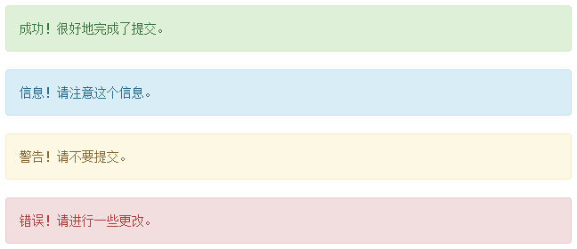
You can create a <div>, and add a.alert class and four context-class (ie .alert-success, .alert-info,.alert-warning, .alert-danger) one to add a basic warning box. The following example illustrates this point:
Examples
<Div class = "alert alert-success" > Success! Well done submit. </ Div>
<Div class = "alert alert-info" > information! Please note this information. </ Div>
<Div class = "alert alert-warning" > Warning! Please do not submit. </ Div>
<Div class = "alert alert-danger" > Error! Please make some changes. </ Div>
The results are as follows:
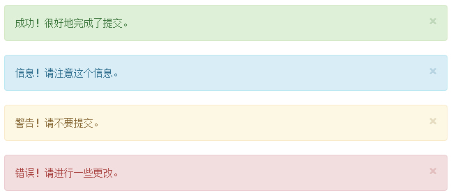
Warning revocable (Dismissal Alerts)
Create a revocable warning (Dismissal Alert) as follows:
- By creating a <div>, and add a.alert class and four context-class (ie .alert-success, .alert-info,.alert-warning, .alert-danger) one to add a basic warning box.
- At the same time add the optional.alert-dismissable to top <div> class.
- Add a close button.
The following example illustrates this point:
Examples
<Div class = "alert alert-success alert -dismissable">
<Button type = "button" class = "close" data-dismiss = "alert"
aria-hidden = "true">
& times;
</ Button> Success! Well done submit. </ Div>
<Div class = "alert alert-info alert -dismissable">
<Button type = "button" class = "close" data-dismiss = "alert"
aria-hidden = "true">
& times;
</ Button> Information! Please note this information. </ Div>
<Div class = "alert alert-warning alert -dismissable">
<Button type = "button" class = "close" data-dismiss = "alert"
aria-hidden = "true">
& times;
</ Button> Warning! Please do not submit. </ Div>
<Div class = "alert alert-danger alert -dismissable">
<Button type = "button" class = "close" data-dismiss = "alert"
aria-hidden = "true">
& times;
</ Button> Error! Please make some changes. </ Div>
 Be sure to use <button> element withdata-dismiss = "alert" dataattributes.
try it" The results are as follows:
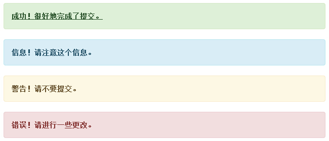
Warning (Alerts) link in
To create a link in the Warning (Alerts) as follows:
- By creating a <div>, and add a.alert class and four context-class (ie .alert-success, .alert-info,.alert-warning, .alert-danger) one to add a basic warning box.
- Use.alert-link entity classes to quickly link with matching colors.
Examples
<Div class = "alert alert-success" >
<A href = "#" class = "alert-link"> Success! Well done submit. </ A>
</ Div>
<Div class = "alert alert-info" >
<A href = "#" class = "alert-link"> information! Please note this information. </ A>
</ Div>
<Div class = "alert alert-warning" >
<A href = "#" class = "alert-link"> Warning! Please do not submit. </ A>
</ Div>
<Div class = "alert alert-danger" >
<A href = "#" class = "alert-link"> Error! Please make some changes. </ A>
</ Div>
The results are as follows: