SVG shadow
Note: Internet Explorer and Safari does not support SVG filters!
<Defs> and <filter>
SVG filters all Internet defined in <defs> element. <Defs> element defines short and contains special elements (such as filters) definition.
<Filter> tag is used to define SVG filter. <Filter> tag with the required id attribute to define the graphical application which filters?
SVG <feOffset>
Example 1
<FeOffset> element is used to create a shadow effect. The idea is to take a SVG graphics (or image elements) and move it around a little in the xy plane.
The first example offset a rectangle (with <feOffset>), and then mixed offset top of the image (including <feBlend>):
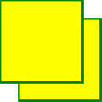
Here is the SVG Code:
Examples
<defs>
<filter id="f1" x="0" y="0" width="200%" height="200%">
<feOffset result="offOut" in="SourceGraphic" dx="20" dy="20" />
<feBlend in="SourceGraphic" in2="offOut" mode="normal" />
</filter>
</defs>
<rect width="90" height="90" stroke="green" stroke-width="3"
fill="yellow" filter="url(#f1)" />
</svg>
try it"
For Opera users: view SVG file (right-click on the preview source SVG graphics).
Code analysis:
- The only name <filter> element id attribute defines a filter
- Filter Properties <rect> element is used to link the elements to "f1" filter
Example 2
Now, you can shift the image becomes blurred (containing <feGaussianBlur>):
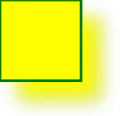
Here is the SVG Code:
Examples
<defs>
<filter id="f1" x="0" y="0" width="200%" height="200%">
<feOffset result="offOut" in="SourceGraphic" dx="20" dy="20" />
<feGaussianBlur result="blurOut" in="offOut" stdDeviation="10" />
<feBlend in="SourceGraphic" in2="blurOut" mode="normal" />
</filter>
</defs>
<rect width="90" height="90" stroke="green" stroke-width="3"
fill="yellow" filter="url(#f1)" />
</svg>
try it"
For Opera users: view SVG file (right-click on the preview source SVG graphics).
Code analysis:
- stdDeviation <feGaussianBlur> element property defines the amount of blurring
Example 3
Now make a black shadow:
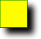
Here is the SVG Code:
Examples
<defs>
<filter id="f1" x="0" y="0" width="200%" height="200%">
<feOffset result="offOut" in="SourceAlpha" dx="20" dy="20" />
<feGaussianBlur result="blurOut" in="offOut" stdDeviation="10" />
<feBlend in="SourceGraphic" in2="blurOut" mode="normal" />
</filter>
</defs>
<rect width="90" height="90" stroke="green" stroke-width="3"
fill="yellow" filter="url(#f1)" />
</svg>
try it"
For Opera users: view SVG file (right-click on the preview source SVG graphics).
Code analysis:
- Properties <feOffset> element to "SourceAlpha" use blur in the Alpha channel, rather than the entire RGBA pixels.
Example 4
Shadow is now coated with a color:
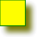
Here is the SVG Code:
Examples
<defs>
<filter id="f1" x="0" y="0" width="200%" height="200%">
<feOffset result="offOut" in="SourceGraphic" dx="20" dy="20" />
<feColorMatrix result="matrixOut" in="offOut" type="matrix"
values="0.2 0 0 0 0 0 0.2 0 0 0 0 0 0.2 0 0 0 0 0 1 0" />
<feGaussianBlur result="blurOut" in="matrixOut" stdDeviation="10" />
<feBlend in="SourceGraphic" in2="blurOut" mode="normal" />
</filter>
</defs>
<rect width="90" height="90" stroke="green" stroke-width="3"
fill="yellow" filter="url(#f1)" />
</svg>
try it"
For Opera users: view SVG file (right-click on the preview source SVG graphics).
Code analysis:
- <FeColorMatrix> Offset filter is used to convert an image to make it closer to the black color. '0.2' to obtain three values are multiplied by a matrix of red, green, and blue color channels. Reducing its value to bring color to black (black is 0)