Foundation grid system
Foundation for the 12 grid system.
If you do not have 12, you can merge a number of columns, create a series of greater width.
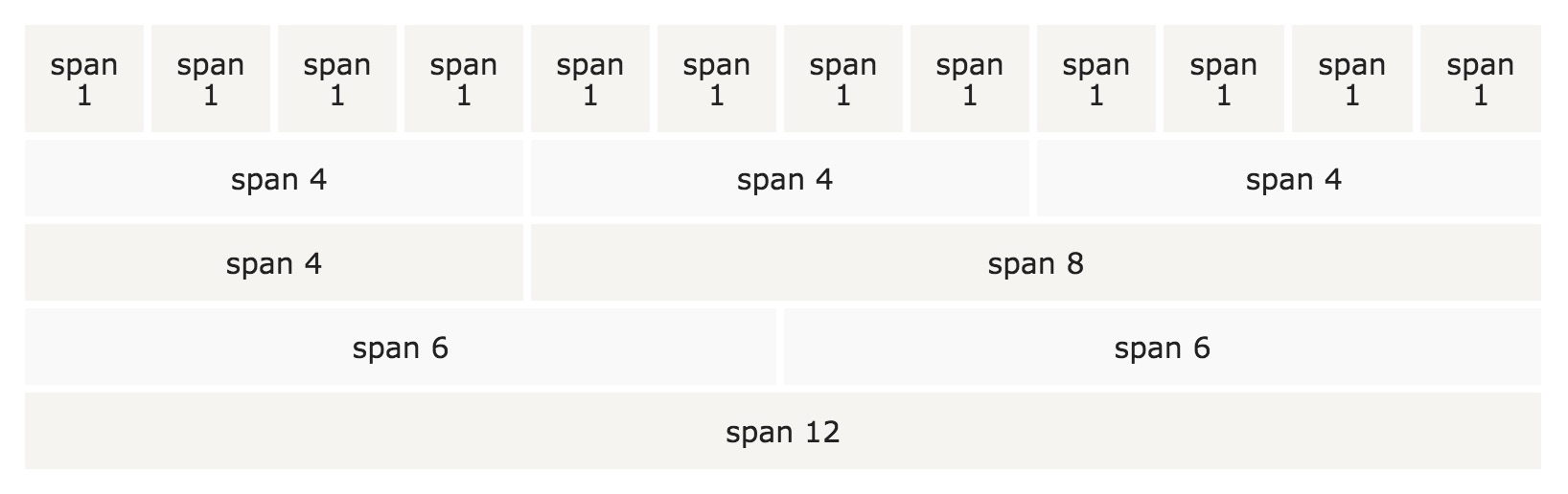
Foundation of the grid system is responsive. Column will automatically resize based on the screen size. On a large screen, it may be three, the small screen size, it could be three separate, sequential.
Grid Column
Foundation grid system has three columns:
-
.small(mobile terminal) -
.medium(tablet) -
.large(computer equipment: notebook, desktop)
Above classes can be combined to create a more flexible layout
The basic structure of the grid
The following are the basic grid structure instance Foundation:
Examples
<Div class = "small | medium | large- num columns"> </ div>
</ Div>
<Div class = "row">
<Div class = "small | medium | large- num columns"> </ div>
<Div class = "small | medium | large- num columns"> </ div>
<Div class = "small | medium | large- num columns"> </ div>
</ Div>
<Div class = "row">
...
</ Div>
First, create a row ( <div class="row"> ). This is a level of vertical columns. Then add the number of columns described small- num , medium- num and large- num class. Note: The number of columns num must add up to 12:
Examples
<Div class = "small-12 columns"> .small-12 yellow </ div>
</ Div>
<Div class = "row">
<Div class = "small-8 columns"> .small-8 beige </ div>
<Div class = "small-4 columns"> .small-4 gray </ div>
</ Div>
<Div class = "row">
<Div class = "large-9 small-8 columns"> .small-8 .large-9 pink </ div>
<Div class = "large-3 small-4 columns"> .small-4 .large-3 orange </ div>
</ Div>
try it"
Example, the first line of the <div> class .small-12 , which creates 12 (100% width).
The second line creates two columns, .small-4 width is% 33.3, .small-8 width of 66.6%.
The third line we added two extra columns ( .large-3 and .large-9 ). This means that if the large screen size, the column will become% 25 ( .large-3 )% and 75 ( .large-9 ratio) of. We also specify the proportion of the small screen above the% 33 ( .small-4 )% and 66 ( .small-8 ). Such combinations for different screen display is very helpful.
Grid Options
The following table summarizes the Foundation explained grid system on multiple devices:
| Small equipment Phones (<40.0625em (640px)) | Moderate equipment Tablets (> = 40.0625em (640px)) | Large equipment Laptops & Desktops (> = 64.0625em (1025px)) | |
|---|---|---|---|
| Grid Behavior | It has been the level of | Began to collapse, break above horizontal | Began to collapse, break above horizontal |
| Class prefix | .small- * | .medium- * | .large- * |
| Number of classes | 12 | 12 | 12 |
| Can be embedded | Yes | Yes | Yes |
| Offset | Yes | Yes | Yes |
| Column sorting | Yes | Yes | Yes |
Widescreen
Grid maximum ( .row ) width 62.5rem. On widescreen, when the width is greater than 62.5rem, the column does not span the width of the page, even if the width is set to 100%. But you can reset via CSS max-width:
If you use the default max-width, but want the background color across the entire width of the page, you can use .row wrap the entire container, and you need to specify a background color:
Examples
<Div class = "row">
<Div class = "small-6 columns" style = "background-color: yellow;"> small-6 </ div>.
<Div class = "small-6 columns" style = "background-color: pink;"> small-6 </ div>.
</ Div>
</ Div>
try it"