Foundation reminder box
Foundation can be very simple to create an alert box:
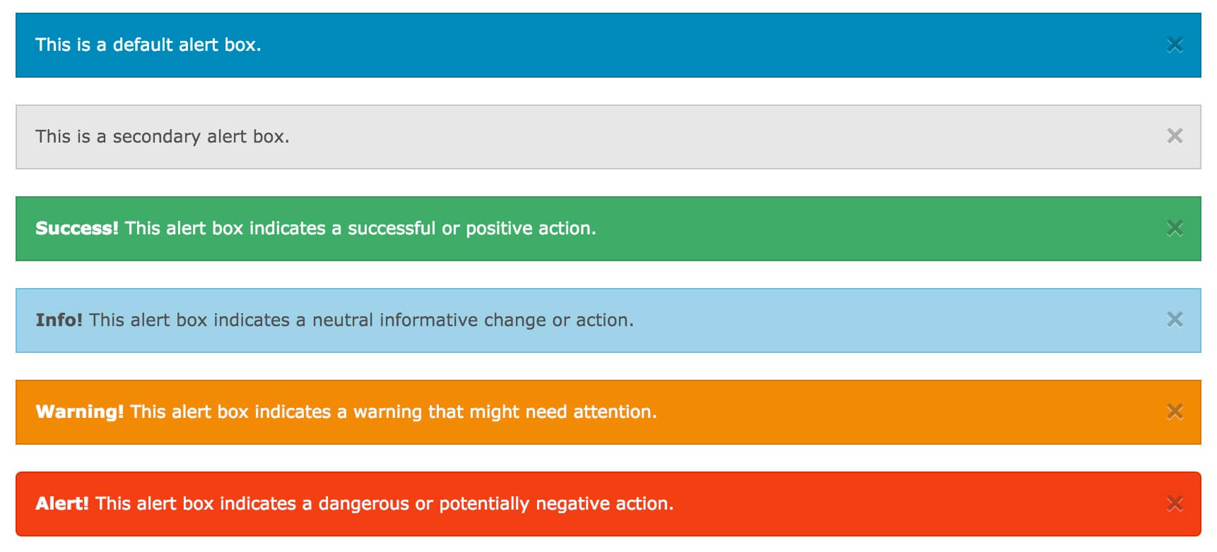
You can use the reminder box .alert-box class created, you can add the optional categories: .secondary , .success , .info , .warning or .alert :
Examples
<Div data-alert class = " alert-box">
This is a default alert box.
</ Div>
<Div data-alert class = " alert-box secondary">
This is a secondary alert box.
</ Div>
<Div data-alert class = " alert-box success">
<Strong> Success! </ Strong > This alert box indicates a successful or positive action.
</ Div>
<Div data-alert class = " alert-box info">
<Strong> Info! </ Strong > This alert box indicates a neutral informative change or action.
</ Div>
<Div data-alert class = " alert-box warning">
<Strong> Warning! </ Strong > This alert box indicates a warning that might need attention.
</ Div>
<Div data-alert class = " alert-box alert">
<Strong> Alert! </ Strong > This alert box indicates a dangerous or potentially negative action.
</ Div>
try it"
 | Width reminder box 100% of the container. |
|---|
Fillet reminder box
.radius and .round class is used to add rounded corners alert box:
Examples
<Div data-alert class = " alert-box success radius">
<Strong> Success! </ Strong > Alert box with a radius.
</ Div>
<Div data-alert class = " alert-box info round">
<Strong> Info! </ Strong > Alert box that is rounded.
</ Div>
<Strong> Success! </ Strong > Alert box with a radius.
</ Div>
<Div data-alert class = " alert-box info round">
<Strong> Info! </ Strong > Alert box that is rounded.
</ Div>
try it"
Close reminder box
To close the alert box, you can add or button on the connection element class="close" category, and initialize Foundation JS:
Examples
<Div data-alert class = " alert-box">
This is a default alert box with closing functionality.
<A href = "#" class = "close"> & times; </ a>
</ Div>
<Script>
// Initialize Foundation JS For Functionality
$ (Document) .ready (function () {
$ (Document) .foundation ();
})
</ Script>
This is a default alert box with closing functionality.
<A href = "#" class = "close"> & times; </ a>
</ Div>
<Script>
// Initialize Foundation JS For Functionality
$ (Document) .ready (function () {
$ (Document) .foundation ();
})
</ Script>
try it"
| & Times; (×) is an HTML character entity represents a close button icon, not the letter "x". |
|---|