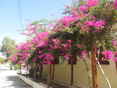
Responsive Web Design - Photo
Use the width attribute
If the width attribute is set to 100%, the picture will be realized in accordance with the upper and lower range of responsive functions:
Note that in the above example, the image will be larger than its original image. We can use max-width attribute a good solution to this problem.
Using max-width property
If the max-width property is set to 100%, the picture will never be larger than its original size:
Add image pages
Background picture
Background image can respond to resize or zoom.
The following are three different methods:
1. If the background-size property is set to "contain", the background image will be adaptive content area ratio. Photos maintain its proportions unchanged:
This is the CSS code:
Examples
width: 100%;
height: 400px;
background-image: url ( 'img_flowers.jpg ');
background-repeat: no-repeat;
background-size: contain;
border: 1px solid red;
}
try it"
2. If the background-size property is set to "100% 100%", the background image will be extended to cover the entire region:
Examples
This is the CSS code:
width: 100%;
height: 400px;
background-image: url ( 'img_flowers.jpg ');
background-size: 100% 100% ;
border: 1px solid red;
}
try it"
3. If the background-size property is set to "cover", the background image is expanded to be large enough to completely cover the background so that the background image area. Note that the property remains the proportions of the picture so some part of the background image can not be displayed in the background positioning area.
This is the CSS code:
Examples
width: 100%;
height: 400px;
background-image: url('img_flowers.jpg');
background-size: cover;
border: 1px solid red;
}
try it"
Different devices show a different picture
Large pictures can be displayed on the big screen, but they do not show well on the small screen. We do not need to load up the small screen in the big picture, so it is affecting the loading speed. So we can use media queries, depending on the device to display a different image.
The following big picture and small picture will be displayed on different devices:


Examples
body {
background-image: url('img_smallflower.jpg');
}
/* For width 400px and larger: */
@media only screen and (min-width: 400px) {
body {
background-image: url('img_flowers.jpg');
}
}
try it"
You can use media queries min-device-width substitute min-width attribute, it will detect the device width instead of the browser width. Reset the browser size, image size does not change.
Examples
body {
background-image: url ( 'img_smallflower.jpg ');
}
/ * Device larger than 400px (also equal to): * /
@media only screen and (min-device -width: 400px) {
body {
background-image: url ( 'img_flowers.jpg ');
}
}
try it"
HTML5 <picture> element
HTML5's <picture> element can be set multiple images.
Browser Support
| element | |||||
|---|---|---|---|---|---|
| <Picture> | not support | 38.0 | 38.0 | not support | 25.0 |
<picture> element similar to the <video> and <audio> elements. Different devices can be resources, resource first set of preferred use:
Examples
<Source srcset = "img_smallflower.jpg" media = "(max-width: 400px)">
<Source srcset = "img_flowers.jpg">
<Img src = "img_flowers.jpg" alt = "Flowers">
</ Picture>
try it"
srcset property must be the definition of the image resource.
media attribute is optional, in media queries CSS @media rule See details.
Do not support <picture> browser elements you can define <img> element instead.