Bootstrap grid system Example: medium and large equipment
In Example: stack level , we have seen the basic grid system. Here, we use two div, and in the middle of the viewport width of them 50% / 50% split:
<Div class = "col-md-6"> .... </ div>
<Div class = "col-md-6"> .... </ div>
However, on large-scale equipment, your final design to 33% / 66%. So we have to do is be prepared to change the column width of the breakpoint:
<Div class = "col-md-6 col-lg-4"> .... </ div>
<Div class = "col-md-6 col-lg-8"> .... </ div>
Now Bootstrap in medium-sized equipment, looks for classes withmd, and use them.In large-scale equipment, looks for classes withlg, and use them.In this example, our two div from 50% / 50% split into 33% / 66%. See the example below for verification. (Here, the columns are defined for each style, you can avoid doing so.)
<! DOCTYPE html>
<Html>
<Head>
   <Title> Bootstrap instance - medium and large equipment </ title>
   <Link href = "/ bootstrap / css / bootstrap.min.css" rel = "stylesheet">
   <Script src = "/ scripts / jquery.min.js"> </ script>
   <Script src = "/ bootstrap / js / bootstrap.min.js"> </ script>
</ Head>
<Body>

<Div class = "container">
   <H1> Hello, world! </ H1>

   <Div class = "row">

      <Div class = "col-md-6 col-lg-4" style = "background-color: # dedef8;
         box-shadow: inset 1px -1px 1px # 444, inset -1px 1px 1px # 444; ">
         <P> Lorem ipsum dolor sit amet, consectetur adipisicing elit, sed do
            eiusmod tempor incididunt ut labore et dolore magna aliqua. Ut
            enim ad minim veniam, quis nostrud exercitation ullamco laboris
            nisi ut aliquip ex ea commodo consequat.
         </ P>

         <P> Sed ut perspiciatis unde omnis iste natus error sit voluptatem
            accusantium doloremque laudantium, totam rem aperiam, eaque ipsa
            quae ab illo inventore veritatis et quasi architecto beatae vitae
            dicta sunt explicabo.
         </ P>
      </ Div>

      <Div class = "col-md-6 col-lg-8" style = "background-color: # dedef8;
         box-shadow: inset 1px -1px 1px # 444, inset -1px 1px 1px # 444; ">
         <P> Sed ut perspiciatis unde omnis iste natus error sit voluptatem
            accusantium doloremque laudantium.
         </ P>

         <P> Neque porro quisquam est, qui dolorem ipsum quia dolor sit amet,
            consectetur, adipisci velit, sed quia non numquam eius modi
            tempora incidunt ut labore et dolore magnam aliquam quaerat
            voluptatem.
         </ P>
   </ Div>
</ Div>

</ Body>
</ Html>
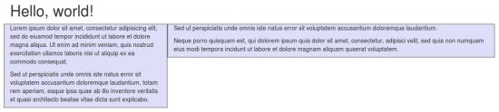
The results are as follows: